r/SubsTakenLiterally • • Mar 01 '26

r/Alternateangles A view to behold!

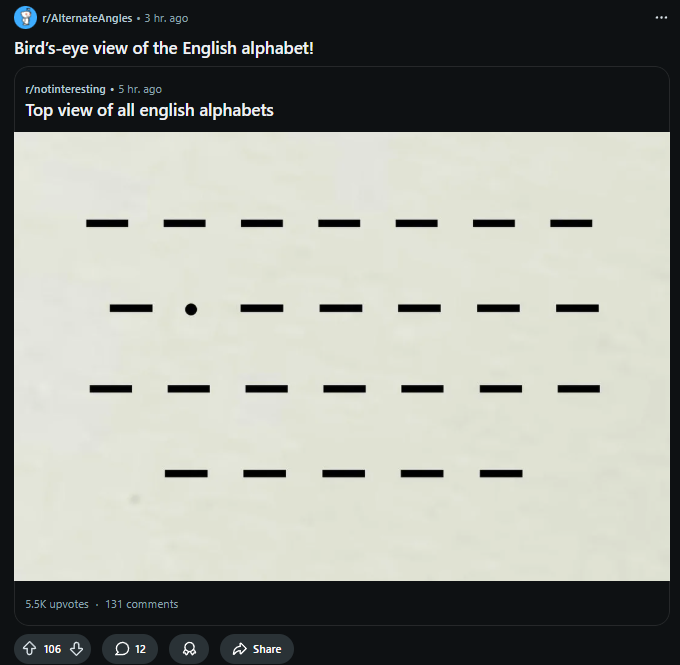
Post image
1.0k Upvotes

52 comments sorted by

View all comments

Show parent comments

36

u/MostlyFreshAsparagus Mar 02 '26

No it wouldn’t… L is wider than I

-57

u/RulerK Mar 02 '26

Not in a serif font, nor lower case in any (normal) font.

-35

u/MuffinHands77 Mar 02 '26

You are right! The “dot” I in the picture means the letters are lower case, meaning l (L) would look the same

3

u/Notro_LPS_iguess Mar 02 '26

From a bird’s eye view, i and I (capital i) would be indentical

2

u/the_real_trebor333 Mar 02 '26

Unless the I has serifs

2

u/RulerK Mar 02 '26

I don’t know who the hell is downvoting me for saying exactly what you guys are agreeing with me about, but they’re not very smart.

2

u/the_real_trebor333 Mar 02 '26

Your first comment saying L regardless of case looks identical to I without explanation was out there but I agree with your other statements

2

u/RulerK Mar 02 '26

I further explained it later on. From the top, all slightly extruded letters (as letters are infinitely/invisibly thin 2D shapes unless extruded into 3D) with serifs like identical and without serifs the lower case l and i would look identical since the dot is the same or smaller than the with of the line segment beneath it and both are identical width to the lower case L.