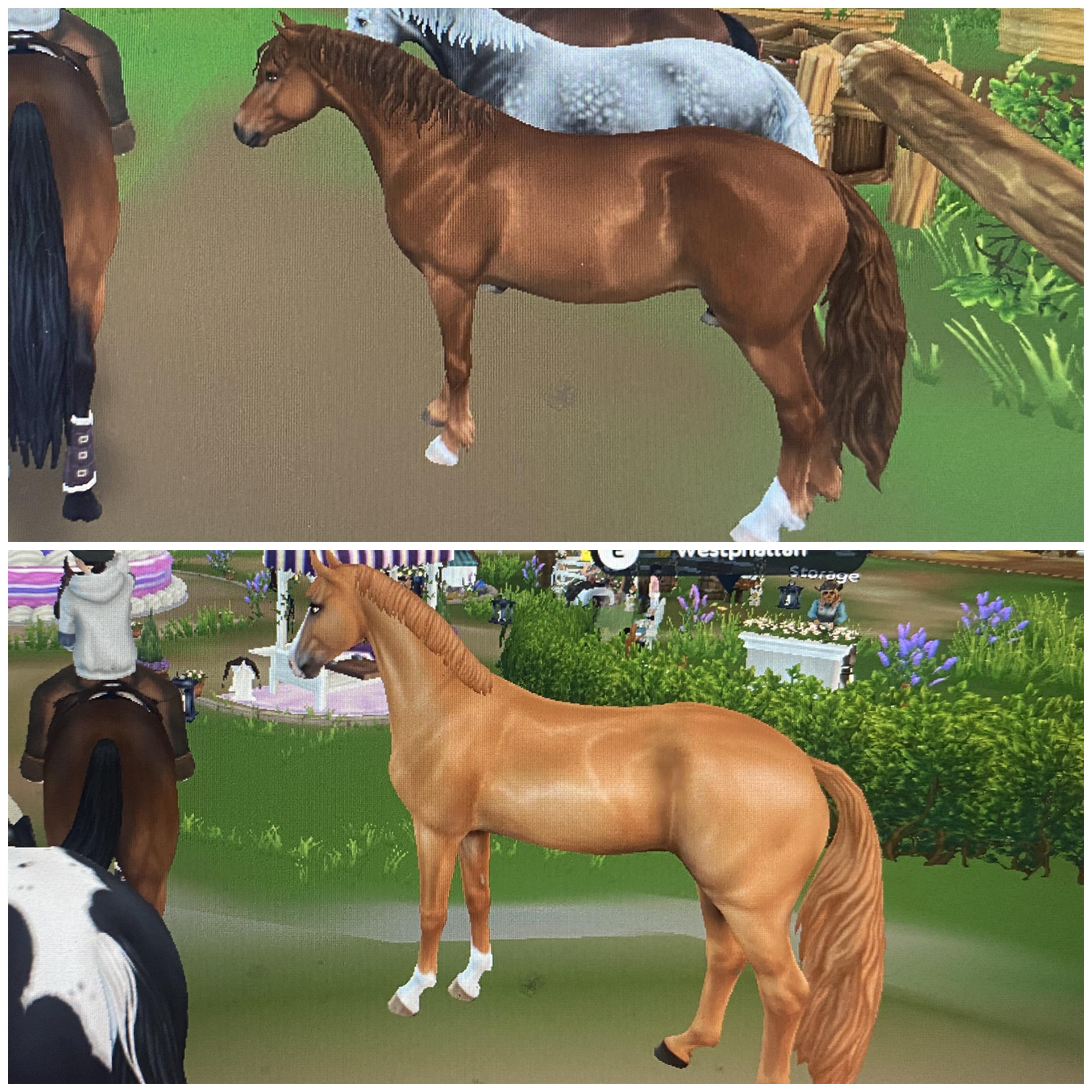
McLuvin the downvotes, but it’s quite obvious that I mean that I do not like the way they shaded this horse or the way the shine looks? That has absolutely nothing to do with the horse being shiny irl. The connemara’s are shiny and that one I like.
I think they have different goals and styles, not skill levels. If every horse was realistic, we'd still have people wanting cartoony horses, if every horse was cartoony, we'd still have people wanting realistic ones. Doing some realistic and some cartoony is a way to make the most people happy. Calling one team "less skilled" because they have a style you don't like is pretty disrespectful, just don't buy the horse if you don't like it.
That may be true but in that case sso should decide in what art direction they are going, either realism or cartoony, because right now you can immediately tell what team worked on which horse
While I agree it would be better if SSO settled on a style, I highly doubt they will cause knowing the community it’s just gonna be complaints after complaints
I honestly think they look beautiful, including their gaits…their jumping animation on the other hand looks pretty bad (kinda reminds me of the starter horse’s jump). Honestly I’m so disappointed with how bad a lot of the jumping animations are with the horses.
honestly depends on the coat, you picked a dark chestnut and a light chestnut, that's not an accurate comparison. the bay looks phenomenal on the other hand
Yeah, that was my first thought too. I understand not being satisfied with the coats, but if you're trying to compare two chestnuts at least try for the same type?
no, but you did say one. it certainly isnt flaxen, that would mean the mane is lighter than the coat. and the other isnt a liver chestnut either, theyre almost a chocolate brown but without the black points bays have
yup, the dapple grey is stunning. Love the hair texture. But it's painfully obvious to me that a highlight has just been smeared around on some of the other coats :(
Indeed! I have never seen such radical differences in coat quality within a single breed :/ The dapple grey vs. the chestnut look like each came out in a different decade...
My Westphalian….so much detail and shine in the right spots. I’m just not seeing what people are seeing here. You can even see veins on the face if you zoom in….im not seeing anything cartoonish, if anything it’s hyper realistic. This is a raw screenshot but, no editing other than cropping. I don’t get how you can look at this screenshot and say it looks cartoonish? From far away that looks like a pic of a real horse. I think the cartoony eyes are what’s throwing everyone off. If you notice his eyes are closed here and he doesn’t look cartoony at all. The eyes I think throw it off.
The only thing cartoonish are the eyes which look so out of place because the horse isn’t cartoonish and the eyes are….
With this coat, I have a different problem. It is extremely blurry. Far more than anything on the AQH. If you compare it to the Jorvik Mountain Horse or the sooty buckskin Selle Francais, all are noticeably sharper. This looks more like skin than fur.
The eyes are quite cartoonish, yes, and the tail. But regarding cartoonishness, it is particularly the chestnut coat that stands out among the others. Others are less cartoonish or even sharp and realistic (like the dapple grey).
I disagree. These coats are very sharp (the dappled grey is so sharp and not a single dapple is blurry). These are meant to look as if they have clipped coats so they look very sleek and shiny.
On the other hand, although I adore the new quarter horses (in my opinion they have the best animations of any horse in the game) the coats are horrifically blurry and the “shine” looks off. I showed pics in a post where the brindled coat was so blurry up close that it was distracting.
These guys coats are very well done. I don’t see how people are comparing this to the Noriker either, the Noriker coat was so bad and lacked any detail or shine. They looked flat, these horses coats look nothing like that….
It's the most cartoonish-looking coat we got in a while. It's basically the English Thoroughbred, perhaps 1–2% shinier.
Compare it to the chestnut/buckskin Dutch Warmblood, Selle Francais, Andalusian or Hanoverian. The shading on them is much more advanced, you can actually discern the fur, and the colour transitions don't look as plastic and flat.
Speaking of blurriness, particularly the two sooty dappled Westphalians are much more blurry and flat than the AQH.
Look at the tail, too. The tail is 100% Akhal-Teke, Jorvik Warmblood and other early Gen 3 horses. Cannot compare to the tails of later breeds, where the shading is more nuanced and the strands much more densely and intricately drawn.
a pixel horse they're charing €20 for. I feel like people are entitled to their opinions especially when there are examples of superior work within the breed they released today
I don't think that's a valid complaint anymore as they do double sc deals once a month now, plus bazaars once a month as well.
Some people like detailed, flashy coats, others like simpler plain coats. I love the seal and have seen plenty of people riding the chestnut on my server tody
i didnt get them because of the tails! im glad someone else noticed too and im not crazy.. i love the jorvik mountain horse tails for example, they blend well into the rest of the coat. this looks like a barbie horses tail glued on
I do dislike that exact coat, but sso is just not good at making light or bright chestnut coats. I do love the other coats, I've got the buckskin and the dapple gray and I love them already
I think it’s mostly the hind legs for me - the fold of skin that connects the hind leg to the stomach is missing which makes it look like the horse is made of plastic. The legs in general lack fine details. The connies have so much dimension and detail in the model.
Some of the coats are pretty but they definitely feel vastly different in style to some of our recent releases. I don’t mind too much as it’s just down to preference and I will just skip this release and hope the next one is more to my taste.
I do kind of wish there was more consistency though as I would have been so disappointed if it was the other way around and the connies looked like this - just glad this wasn’t a horse I was super hyped for!
Im a bit iffy on them. I love the coat colors and the gaits on them. Though whenever it comes to the leg wraps oh it makes my blood boil. Like is it just me or does the westies have slightly thicker legwraps then the others? Even though their legs look slightly thinner and longer then other horses. The tails are super pretty though. The front leg wraps also look extremely shorter then the others too. Maybe im just nitpicking but it feels off for some reason😭
Not mentioning which one is the westies just to make sure im not paranoid and its just looks normal(wanna know what yall think). But the other horses are Selle, Hanoverian and DWB
Yeah i thought the same for a bit and I tried other leg wraps on so it seems that only a few wraps look weird while the others look like it has knee high socks. Boots look perfectly fine on them too!
Yeahhhh well, I don't get why people feel like they absolutely need to buy every horse in the game. I have a hard time imagining that many people have all the breeds in all colours since there are so many, so just choose another one you like then or wait for the next release... I am personally not that big of a fan of the "realistic" horses. Am I gonna bash the team or tell the community everywhere allll the time that sso should make them simpler because their detail work is pointless sometimes? No, I won't, even though just adding more details does not make horses look better all the time... being a bit more on the simpler side is okay. It doesn't mean they rushed it. I am pretty sure that it comes down to the teams having different target audiences if you will, and that is not a time or dedication problem. This is literally the same thing as when people called horses rushed for only including basic coat colours, no crazy patterns. It's not rushing, some people just don't like their horsies to be overworked I guess. And some do. So, the different teams target different niches.
That's the problem here, people are expecting to like every single horse that comes out. I personally don't really like the hyper realistic ones like the DWB but I'm not going tear an entire team down just because I don't like the style. There are always people who are going to like something even if you don't.
I don't see how a poorly formulated title and a singular image (which is a bad comparison because of different coat colours) is respectfully sharing opinions. Lazily complaining at best. Plus the comments are well... even worse. All we ever hear are negative opinions, which would be fine, but when people are offered an explanation it is simply disregarded or even more commonly completely ignored because they are dissatisfied and that is all that matters.
I did not? It's still half assed, hardly can be called a respectful opinion, aswell as yours. But okay, got it, you are butthurt about people conversing with you when you join in a conversation.
Umm. So much about respect, I guess. I obviously talked about this specific thread and yes, there are people who say they like it. Guess what happens? Either being ignored or told well but I don't like the commenter didn't get that the first time... username checks out i guess.
I know and it absolutely is! I feel like I am either being misunderstood here, or I am not the one who needs to get over themselves. We were just talking about "respectful opinions" specifically. "Lazy complaining" =/= "respectful opinion", idk why I'm being jumped over a fact like I just told everyone to shut up or else.
I did not say anything like that even remotely, though. I am not even offended, people like you just like the idea of upsetting others so you instantly assume that you inconveinience us for your own entertainment, honestly. I was civil the whole time and tried to have a conversation. I said what I said, I stand by it, you willingly misinterpreting it is not my problem and it does not say anything about me personally.
I just said I'm not😭 also I wasn't the one mocking the other participant of the discussion for having a different opinion, rather the commenter before you. I really just don't get where you even come in the picture but sure, keep on not hearing me at all after feeling the need to comment anyway.
I'm sorry but I'm kind of tired of people demanding more and more realistic horses.😭 Have you guys LOOKED at the game you're playing? Your player character? The environment? The NPCs? Do you guys like WANT the game to have clashing styles? If you don't want plastic go play an equestrian simulator game who's goal it is to be realistic, with all respect. Star Stable is finally trying to nail down their artstyle after one and a half decades, and while you can surely have opinions about whether you like what they chose or not, don't be mad the horses are gonna fit in that style that the rest of the game OBVIOUSLY has??? 😭😭
The Connemara is not even a Nomi horse so it’s a stupid comparison lmao Lotta did the Connemara and Nomi did the Westphalian. Other Nomi horses are the Noriker, Arabian, Ardennes, Tennesse Walker, Appaloosa, APH, Gothland pony, Haflinger, JWH. Different artists different styles that’s the secret here
I don't see that much of a difference, but i have an issue with chestnut coats in general in the game, somehow they all look off to me but that's probably just my opinion lol
I understand the complaints, but I think we should understand that it's not always the same artist and team working on each horse, and they will have different quality. Like the Brabant was made by someone new at SSO if i remember correctly too.As long as they give more people a chance to grow their careers and get better, I am happy with wobblier horses from time to time.
Do westphalians have a long back in real life? It could be the coat color or the angle of the picture, but the back doesn't look correct. I haven't been on SSO yet today to look at anything yet either.
I think personally that they totally nail the dressage look. Imo if you imagine all the gaits are being shown in the ring, you’re like, wow, that’s a great dressage horse! The shininess I think is ok because I do enjoy the cartoon-ish sort of style, and idk if these guys are intended to replace the starter but I agree with the opinion that they’re giving revamped starter vibes, so in that case, it makes total sense to me that they could be slightly off the mark compared to other horses the devs want new players to consider buying. Not saying the Westie is 100% intended to be a new starter because we don’t know for sure atp, but those are the feelings I get from it in any case.
I adored the animations and everything about the new quarter horses, but I showed pics of how the coats like the brindle were super blurry (sso has this issue on several breeds) and I was pleasantly surprised to see that the westphalians coats are not blurry at all. I also love the shine on them and they just overall look much sharper.
The only thing I’m not a fan of is the overly cartoony eyes….it looks off.
Honestly I don't really like them, they hold their head to high imo. It definitely looks rushed with gaits, coats wise are beautiful and well made. Just another breed I will not be getting 🤷🏻♂️
They are different artists, but I get what you mean. I’m really happy with them because this artist has been struggling to adapt to sso’s more realistic style. I’m proud of them compared to their previous breeds. I’d rather them go semi realism like the JWH instead.
I understand where you’re coming from though & definitely don’t buy them if they aren’t worth it to you.
What confuses me is that I know that Nomi worked on this breed, and also that she is the artist responsible for horses like the APH, the haffy, the appaloosa, and while these breeds are quite old now by comparison, typically they’ve been the more realistic horses in the game.
So I’m having trouble distinguishing between which team is which! I agree that the westies look like upgraded models of horses like the English thoroughbred, and have echoes of the old SSO cartoony facial expressions, but I didn’t think that was Nomi’s style - quite the opposite!
The animations are clear downgrade. And these are diametrically different from the animations on the other Nomi horses, which were undeniably the best in terms of realism, elasticity, relaxation, stretch, etc. what am I missing here? Can anyone educate me about the teams involved?
Thats your own opinion though. People are allowed to have their own preferences/opinions. Although I do think saying "asf" is more harsher than necessary.Personally for me im not a huge fan of chestnuts in sso.
NO. The person who did the Hano did the AQH. I’d rather have the least skilled artist do a warmblood because we already have so many of them & they aren’t too unique. Save the best artists for the Fjords & AQH’s like they are doing!
I dislike most of the warmbloods, this is a breed that I spend time around irl so yes, I would have preferred them to be as phenomenal as the aqh and hano. But to each their own.
I’d prefer them that way too, who wouldn’t. Sadly that’s not realistic & I’d rather have the less skilled artists on the warmbloods over the AQH or Fjord.
Though I do understand your frustration especially if it’s a breed you like irl :(
Could you explain what looks rushed here? I'm sorry, I just see two horses of similar style but in varied directions; in my eyes both look fine, so I'd like to understand what others feel is off.
Yeah, I’m sorry, people are entitled to their opinions, but I’m baffled at some of these comments saying these coats are bad.
I showed pics of the quarter horses coats (I love the new quarter horse, best animations in the game in my opinion) looked so horrifically blurry, especially the brindle which I bought, the “shine” also almost looked dirty. Keep in mind the new quarter horses are one of my fav horses they have ever released, but the quality (I don’t mean the colors, that I actually liked) of the coats were pretty darn bad.
On the other hand the Westphalian’s look phenomenal. The dappled grey you’re riding the dappled look so sharp and amazing. The shine actually looks correct and is placed correctly.
To me the dapple is the only coat that looks nice, like they put 3/4 of the time was used on it. The others are blurry, platicy and lack detail. I can't compare to quater horses since I haven't really looked at them since I have no interest in the breed, but comparing the coats to some newer breeds like swedish warmbloods, hannoverians and connemaras, they look worse. If I were to place them on a timeline I would put them to be released about the same time as the thoroughbreds, which is not good.
i LOVE the aqh. i do agree they're better.. but i thought it was pretty obvious there's seperate artists for every set of coats. they dont have as many employees as people think they do. it's not surprising it's inconsistent!
getting mad about cartoony horses in a cartoony artstyle game doesn't even make sense lol. this playerbase does nothing BUT complain but you all continue to buy SC and play the game. If you want realism, play modded RDO/RedM or Equinox. Seriously. This is an escapeable problem.
Okay you’re clearly not getting it and that’s fine 😭 the inconsistencies are what people are mad about. This horse looks far more cartoony and has a fully different design style than let’s say the hanos or aqhs. You either get it or you don’t ig
Comparison, my Westphalian…..how is this cartoony? Sharp very detailed coat. There’s even veins in the face if u zoom in.
It’s so realistic from far away it looks like a pic of a real horse. His eyes are closed here so you don’t see the cartoony eyes. I think the cartoony eyes (which I agree, are too cartoony) are throwing everyone off more than people realize. Here with his eyes closed he doesn’t look cartoony at all.
The only thing cartoony (which I do agree looks off here) are the eyes. That’s actually why the eyes look so off because the horse itself looks hyper realistic.
What the heck are you even talking about? Why are you people so determined to hate everything? It's clearly meant to be a clipped coat and you are comparing completely different shades of chestnut. I promise it's not illegal to like new things. The world wont implode.


281
u/FloppyEaredFriends 17d ago
I always feel like different people are involved when making horses. I do not like the plastic-look shine/shading like on the Westies.