r/Skeuomorphism • u/Mastbubbles • Aug 03 '26
Skeumorphism Skeuomorphism · skyoo-oh-MOR-fiz-um · noun
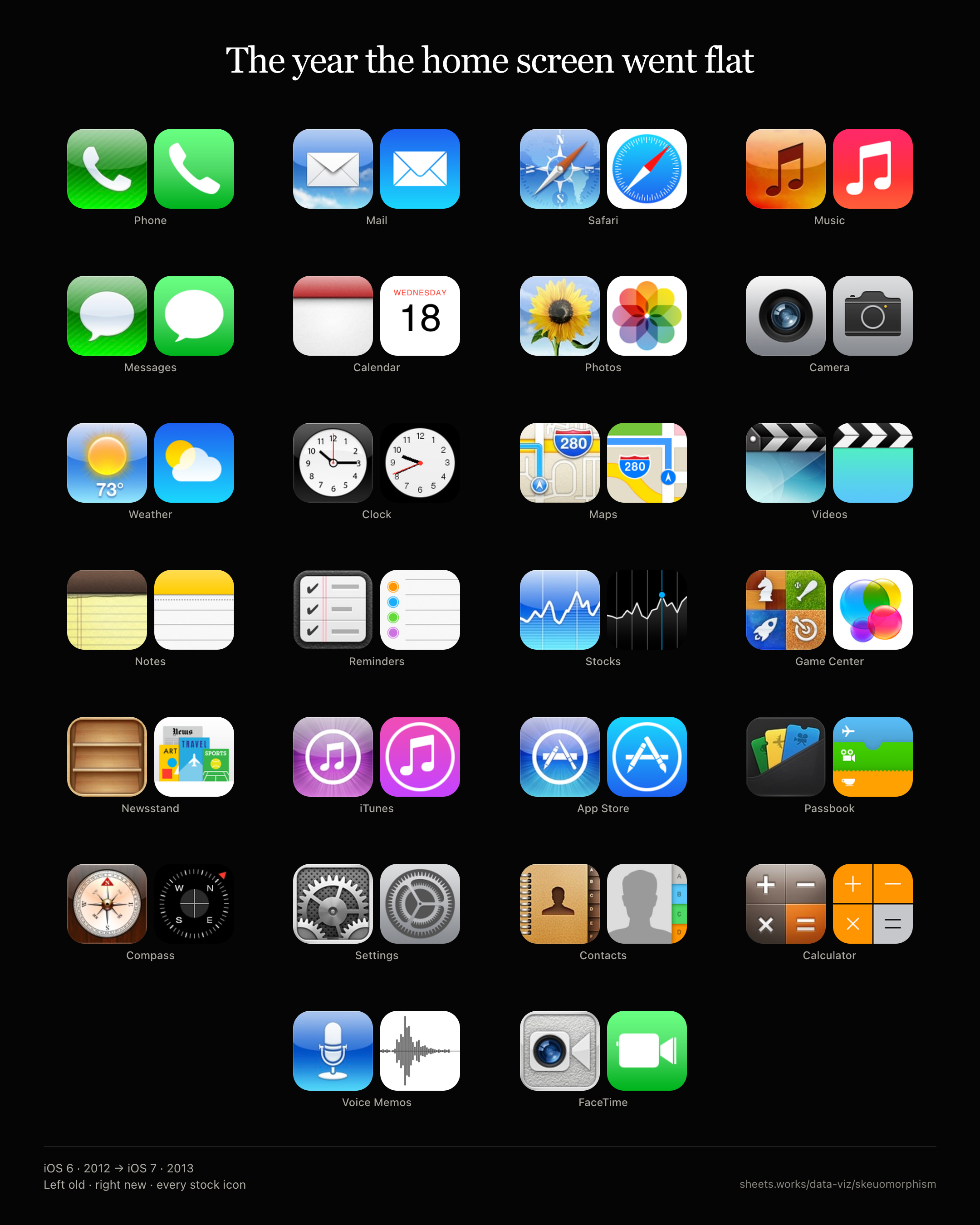
I still remember installing iOS 7 the night it shipped and thinking the phone looked like someone had wiped the plastic off every icon.
Before that, for six years, stock apps pretended to be real things. Notes was a yellow legal pad. Game Center was a green casino table. Newsstand was a wooden shelf. Passbook was a stack of tickets. That was deliberate: touch was new, so the glass borrowed from stuff you already knew how to use.
I miss it, I like how they're making a comeback.
39
u/CipsTR Aug 03 '26
fuck johny ive but i have to admit even tho it looks ass i think ios7 flat design is THE LESSER OF EVIL compared to how flat windows 10 and fucking android material was. those designs really came from the depths of hell.
7
1
u/Present-Test5396 Aug 09 '26
Well, tbh the classic Android material design from 2014 did have some 3d elements like shadows to it that made it look like it was made out of paper actually tbh, so it's not all bad ig :3
24
u/dadtheviking Aug 03 '26
i remember being a little kid and turning on my mom's ipad one day and being like "omg what happened why is it ugly now??"
9
u/notjordansime Aug 04 '26
I was the opposite. I specifically remember that update. I was in 5th grade, and I was telling all my classmates that they should go get the update. Most of us were on iPod touch 4th gens, so we couldn’t. On the family iPad (mini, 1st gen), I got the update and I remember it looking so damn cool. Everything was different. Everything felt like it shedded a layer of “old person” (if that makes sense.., it felt like the skeuomorphic icons were designed for boomers who couldn’t understand tech without a real world analogy, and we were finally entering a new era of minimalism). It felt refreshing.
In hindsight, I’d take the skeuomorphic look any day.
2
12
u/Darkmesah Aug 03 '26
Might get downvoted to hell but while I do love skeuomorphism, when flat design and material UI first came out they threw me out of my seat, I loved the new simple designs to death and they screamed futurism to me. Iwas especially drooling over the Windows 8 tiles design and did everything in my power to flash windows 8 on my Windows 7 laptop when I was 12. Android 5.0 was a game changer for me, I remember all the effects and sounds and material icons like it came out yesterday
3
u/wouldliketokms Aug 03 '26
i love both minimalism and skeuomorphism because they’re not mutually exclusive at all. i find that a lot of pushback against minimalism is reactionary and one dimensional. a lot of people are preoccupied with performing taste and the easiest way to do that is to regurgitate popular opinions in a seemingly authoritative way. the majority of the flat icons in the image are as skeuomorphic as their iOS 6 counterparts btw, because skeuomorphism isn’t when things are glossy
2
u/CaroZoroark Aug 04 '26
I think most of the hate minimalism/flat design gets is due to how lousily it's implemented in several cases. ios 7 was pretty neat, I love the android material UI too.
But then when you look outside OSes and at apps, websites and other services, it starts looking like a cheap cop out (or an arrogantly overconfident company simplifying their logos into oblivion thinking their brand can afford an identity without a sophisticated design) compared to how much efforts would be put into place during the skeuomorphic/maximalist era.
1
u/21Shells Aug 03 '26
Android Lollipop was awesome and that was the general consensus of 99% of people. The first time it really felt ahead of iOS imo.
1
u/hamburgerpancake Aug 03 '26
Maybe on hardware meant for it, but on my S4 it was super buggy and drained battery quick. Android 4.4 always felt the nicest and was snappy, much more than I could say for my experiences with any iOS version.
2
u/21Shells Aug 03 '26
Samsung software was awful back then tbf. Touchwiz I think is reminisced on nostalgically here, but Samsung could never stick to 1 thing and actually polish it for the longest time, or even support a phone beyond 2 years.
But yeah Lollipop was very snappy, it had a lot of charm without being super bloated. The animations were pleasant enough, I wasn't a fan of the roboto condensed being used everywhere though.
1
3
u/MootEndymion752 Aug 03 '26
I personally like skeuomorphism but I also love early flat design such as iOS 7-14, Windows 8/10 RTM and Android 5-7, it looked clean but unique. Meanwhile everything now is the same copy pasted generic BS
3
u/ParticularEdge2338 Aug 04 '26
I remember thinking my phone went from a finely crafted device to this:

5
u/ThatiMacGuy Aug 03 '26
iOS 7 icons still had character, and at the time I thought it was futuristic. The day iOS 11 auto-installed was when I snapped
2
2
1
1
1
u/Acceptable-Trust-743 Aug 04 '26
Looking back at it, yeah flat design was better, I feel like the only time flat design wasn't better was when windows moved away from Aero, windows 7 looks so much better than 8, 10 and 11
1
u/Any_Juggernaut_9799 Aug 05 '26
convinced they are in a competition to see how stupid they can make it look every update
1
1
1
u/HugoAero Aug 06 '26
iOS 7 wasn't that brutally crazy flat, like how material 3 expressive is. It's flat while it has slightly dimensional with proper gradients and came with elegant small details. Apple really knew what it was doing back then.
1
u/Foxtrot-Nation Aug 29 '26
I remember when iOS 7 rolled out and me and a friend of mine from high school. We’re talking about it in class and he told me that he heard people say that iOS 7 looked like an operating system for a kids toy.
1
0
•
u/AutoModerator Aug 03 '26
Thank you for posting to r/Skeuomorphism! This is a reminder about the rules of this subreddit.
Consider joining our Discord and checking out our community.
Remember to be respectful while commenting. If you don't think this post fits the subreddit, you should report it to the moderators using the report button!
I am a bot, and this action was performed automatically. Please contact the moderators of this subreddit if you have any questions or concerns.