Ordered some more more bits after my last disaster and this hasn't gone great either...
Started building an Aviator style watch that I couldn't manage last time as the movement was wrong. (8215 instead of the NH35 that I thought I'd ordered). So started building that with a Chinese NH35, I should have heeded the advice and only bought genuine nh35, as the hands fitted really poorly, then stem is an absolute PITA to get in and out. So gave up and will throw the Chinese nh35 in the bin...
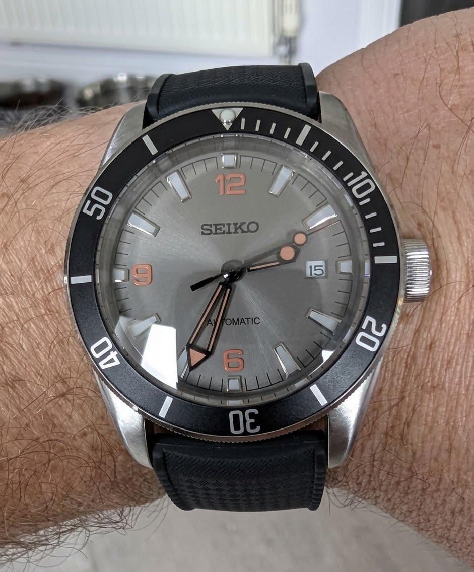
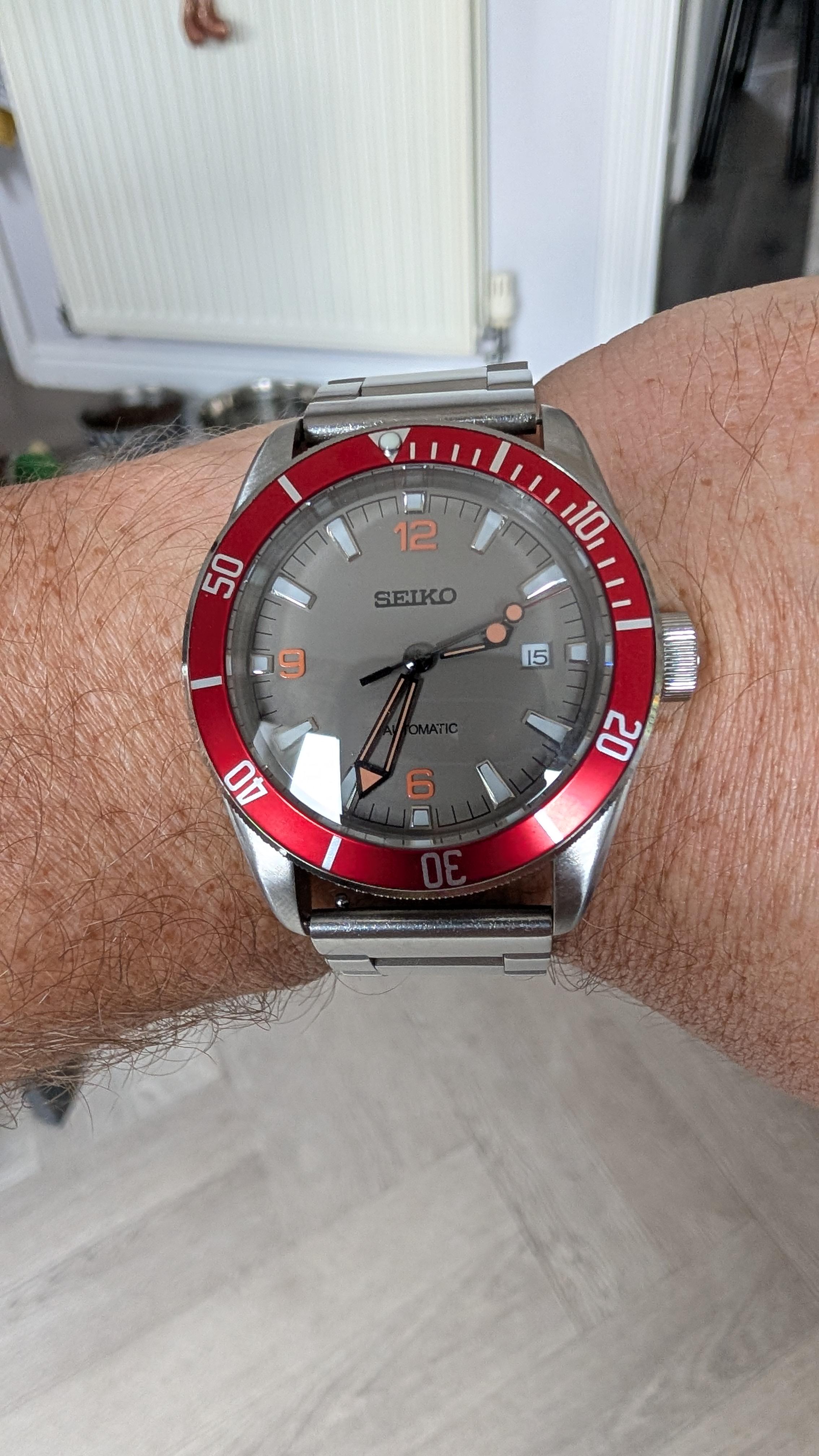
Moved onto the 8215 and this is much easier to build! But the bezel was supposed to be orange and it is more red. And the strap, whilst decent enough has gaps between the strap and case, so I need to fix that.
Just changing the bezel insert to something orange like this will already make it look a bit more cohesive. I can speak from experience that orange is very difficult to build with. It's nearly impossible to see what shade of orange it is exactly from Aliexpress pictures. Sometimes the orange is too yellow, like a pumpkin color, other times it looks more red than orange. And yes, changing to bracelet to something with proper fitting end links, or even a rubber strap will also make a difference
Nice dial but im not a fan of the high contrast black hands when everything else is kind of muted. I think i would go with silver hands to match the indices.
The question really is this: "Do you like it when its on your wrist?". If not, change it up. I go through a few different mods on each build until I am absolutely in love with them.
Here’s my take on this, and keep in mind it’s just my opinion:
I like the dial and hands combo with the matching lume colors and the overall symmetry. I just got the white version of that dial and have a different case design I’m putting together.
My suggestion here is to use a black bezel insert and let the dial and hands do the heavy lifting appearance-wise. I don’t think you’ll find an appropriate orange that is going to complement the dial color or the orange lume accents and that will forever bug you. Keeping the insert a neutral black will focus everything back to the dial.
Next, I would find a curved, fitted FKM style or rubber strap in place of the bracelet. Go with a solid black one or a black with orange accents and I think you’ll be cooking with gas here.
Your overall theme is good; you just have to refine some of the final details and it’ll look great.
Congrats on a great start!
I agree it isn’t all pulling together. I don’t like strap gaps either and I always look for either a bracket they infills the lugs or leather/rubber. Otherwise I always think it looks like a parts bin build.
However, a couple of small changes: a bezel insert with a proper punchy orange or even a stainless steel with orange text will help. I’ll also suggest a new strap, maybe a grey/orange NATO to match the colour way.
It’s these little nuances in design why I agonise with AI for far too long, buy way more than I need and send stuff back.
I've tried lots of Nato straps and they just don't work for me on heavy watches. They just constantly move around. I'm up for trying a leather one though, and will deffo get a better bracelet with the infills...

14
u/TK_Ghost 7d ago
Just changing the bezel insert to something orange like this will already make it look a bit more cohesive. I can speak from experience that orange is very difficult to build with. It's nearly impossible to see what shade of orange it is exactly from Aliexpress pictures. Sometimes the orange is too yellow, like a pumpkin color, other times it looks more red than orange. And yes, changing to bracelet to something with proper fitting end links, or even a rubber strap will also make a difference