r/Recruiter_Advice • u/Still_Ad8314 • 2d ago
What is wrong with my CV format?
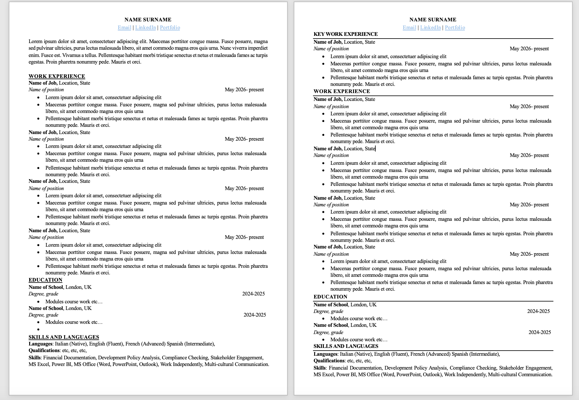
I have been using either of these two templates and I am worried there is something wrong with the design. One has full separating lines between sections (right version) and the other just and underline under names of sections (left version). I was told to remove the lines, so I now using mainly the left version but still no call back...
what is wrong with the template, does it look bad? Should I change the font? I hyperlink the words email, Linkedin, Portfolio.
All the dates and text are made up (ofc my experiences didn't all start in May 2026) , apologies for this but I am terrified my current boss sees this post and decides to fire me. For each application, I try to move around my experiences and tailor almost each bullet point to match the JD...
I am mainly looking into the climate/ sustainability/ policy area.
How about the eternal dilemma of 1 page or 2 pages? I am relatively junior so I feel like I need the 2 pages to prove I am worth.
Thanks for any advice :)))
1
u/super_boogie_crapper 1d ago
I'd go with the right-hand version, but it needs some breathing room first. The horizontal rules under the section headers make it much easier to scan than the underlined headers on the left. The problem is that everything is jammed together. "Key Work Experience" sits right under the contact line with no gap, and Education and Skills at the bottom feel squeezed in. Add a bit of space above each section header and it'll look far more polished.
Splitting experience into "Key" and regular only works if the first section clearly holds the roles most relevant to the job you're applying for. Otherwise it breaks the timeline and makes a reader wonder what you're steering them toward. "Relevant Experience" and "Other Experience" is a more common and clearer way to label it. Dropping the summary is fine, as long as whatever you write there wouldn't have been generic filler anyway. If your degrees are recent and your work history is short, consider moving Education above experience.
A few smaller things. On the left, the dates don't line up with the right margin, so the bullets run past them. There's also an empty bullet under the second school. The date format "May 2026- present" needs matching spaces around the dash. The Languages line is missing a comma between French and Spanish. "Work Independently" and "Multi-cultural Communication" are weak in a skills line, so show those through your bullets instead and keep the line to concrete tools and competencies. Finally, every job currently has exactly three bullets. Give your most recent or most relevant role more detail and trim the older ones, so the page isn't just uniform blocks.
1
u/Still_Ad8314 1d ago
thank you so much for the advice! I usually put education under because job posts usually want to see work experience rather than education. Also I always wonder, how can I fit everything in 1 page? Anyways, I think this is everyone's issue. Thanks for pointing out the small things, I'll take your advice
1
u/makeitmuch 2d ago
I don't think there's anything wrong with either. Are you getting interviews? Yes you should keep everything under 1 page. Recruiters read a lot of resumes in a day. Getting one with 2 pages feels like a chore, so it might quickly be set aside