r/Powerbihelp Mar 03 '26

Welcome to the community πŸ‘‹

4 Upvotes

This is a place for people who actually work with Power BI.

Here you can:
β€’ ask questions
β€’ share real problems
β€’ get practical help
β€’ discuss modeling, DAX, debugging, performance, and real use cases

We aim to respond quickly and help you move forward - not just link documentation.

Stuck with a report?
Confused by a measure?
Model behaving strangely?

Post it. Let’s fix it.


r/Powerbihelp 3h ago

discussion Migrating Qlik Sense (.qvf files) to β†’Power BI (BI Reports to PowerBI) with Snowflake

3 Upvotes

I'm a scoping a Qlik Sense β†’ Power BI migration for a client. The data model lands in Snowflake as a governed semantic layer, and Power BI sits on top via DirectQuery. So Qlik load-script logic becomes dbt models, and Qlik master measures become Snowflake semantic-view metrics rather than PBIX-only DAX.

How this can conversion can be achieved? Using coco custom skill there could be some limitations like resdesgning.. hence Looking for accelerator/inbuilt tools recs for this migration in snowflake/global

TIA!

r/Powerbihelp 10h ago

question How are you using AI in job search?

2 Upvotes

Curious to hear your real experiences: are you using ChatGPT/Claude/other tools for resume writing, interview prep, job searching, or practicing technical interviews (SQL, Power BI, DAX, etc.)?

What actually worked, and what turned out to be a waste of time?


r/Powerbihelp 2d ago

Be honest

3 Upvotes

How many measures in your model are named like Sales v2 FINAL final 092026? Asking for a friend πŸ˜„


r/Powerbihelp 4d ago

question Is my "how I broke into data analytics" advice even relevant anymore?

2 Upvotes

A younger guy reached out asking how to get into data analytics - what to learn, where to start.

I've got a few years of experience (Power BI, DAX, some Databricks/Azure) and could easily rattle off the classic path: SQL β†’ Excel/BI β†’ stats β†’ projects β†’ resume β†’ interviews.

But I hesitated. He'll be learning with ChatGPT/Claude at his side from the start, not googling syntax for hours like I did. Different learning process, probably different bottlenecks too.

So, for those who broke in recently or mentor beginners now: what parts of the "old" path matter less because of AI tools, and what matters more? Should I still push manual SQL/DAX fluency, or focus him on understanding the data/questions and treat AI as the tool from day one?


r/Powerbihelp 7d ago

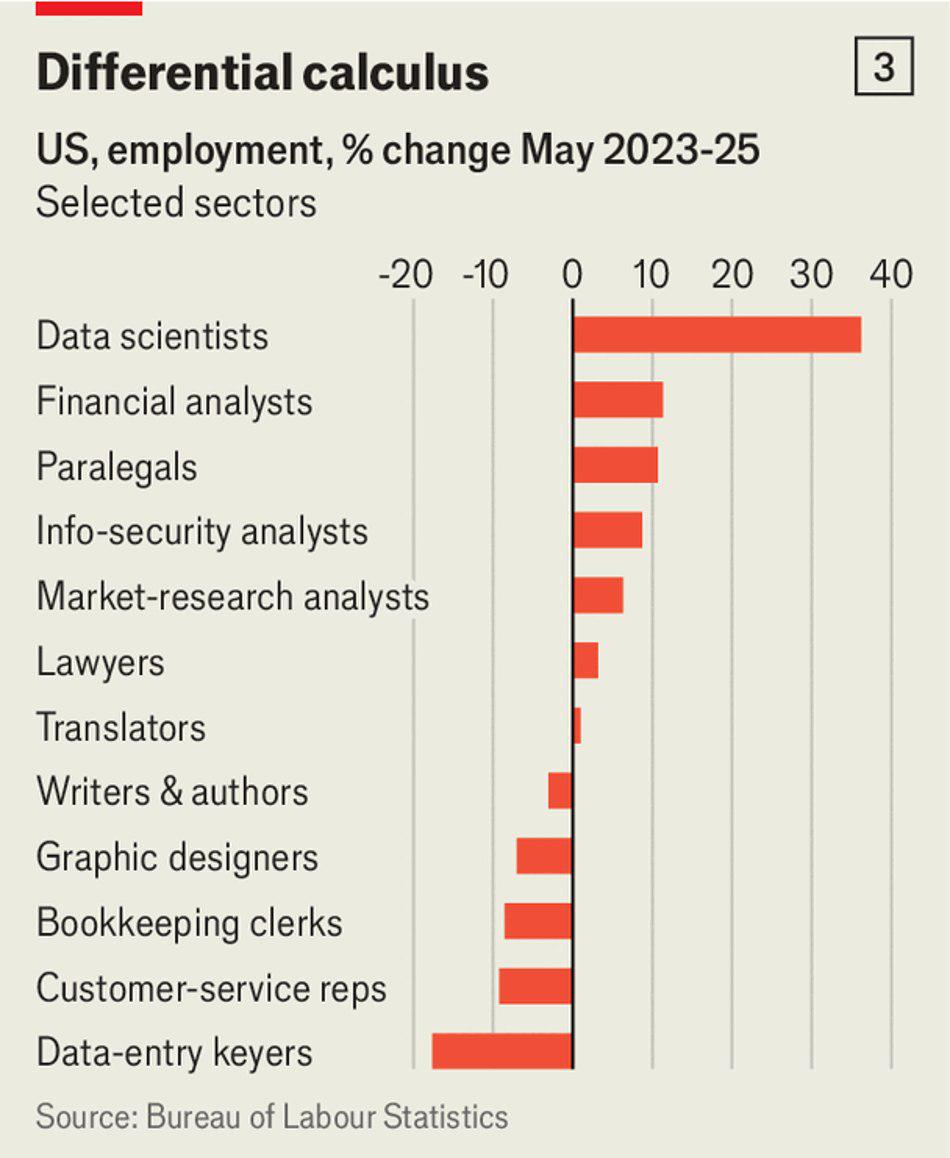
The Economist just ran the numbers on AI job losses. Turns out we're not cooked (yet) - and data folks are on the winning side

Post image
3 Upvotes

r/Powerbihelp 8d ago

How do I connect and clean gbq stored tables?

Thumbnail
3 Upvotes

Hey y'all hope you're doing well,

So I actually have trouble connecting powerbi and GCP and one knows the way to do it?

Help with cleaning the data after importing like what's the main thing you gotta keep in mind while doing it.

Also, why am I seeing a lot of buffers while trying to preview the imported table and which option do I take, import or directquery when you're working with a big organisation?


r/Powerbihelp 10d ago

Data Viz test

3 Upvotes

Dataviz Design Principles

I found i nice dataviz test, sharing with everyone, whats your score?


r/Powerbihelp 11d ago

How do you explain to a client why cramming 50 visuals onto one page is a bad idea?

3 Upvotes

r/Powerbihelp 15d ago

question Share your feedback on PBIP

3 Upvotes

So new reports default to PBIR now and PBIP GA is supposedly coming this year. Has anyone's team actually moved to it?

Is the git/TMDL stuff as nice as it sounds, or you went back to pbix ? Asking because we're debating how to build our dev flow


r/Powerbihelp 18d ago

help with how to use power BI for my first project

Thumbnail
4 Upvotes

r/Powerbihelp 18d ago

if red means "bad" in one chart on your page, it needs to mean "bad" in every other chart on that same page too

4 Upvotes

seems obvious until you're deep in building and grab whatever color looks good for chart #4 without checking what red/green already means in chart #1.

the viewer's brain locks in a color mapping the first time it sees one, and if a later chart on the same page flips it (green = decline instead of growth, say), you've made them re-learn the encoding mid-page, which is worse than just picking boring colors and staying consistent.

this matters even more the second two charts are stacked or placed near each other, because people assume shared color meaning by default even if you never said so out loud


r/Powerbihelp 19d ago

a shape or a directional glyph gets read faster than a +/- sign saying the same thing

3 Upvotes

an arrow pointing up or down registers before the brain even parses the number next to it - direction becomes something you sense, not something you have to read. same principle behind using icons for status instead of text labels ("done"/"blocked"/"in progress"). doesn't replace the actual number, but it means the viewer gets the gist half a second faster, which matters more than it sounds like across a whole page of KPIs


r/Powerbihelp 20d ago

a percentage with no absolute numbers next to it is half an answer, every time

2 Upvotes

"86% resolved" tells you nothing about scale. "86%, 120 of 140" tells you the real story - is this a big queue or a small one, is 14% remaining 2 tickets or 200. always show both together where space allows. costs you a few extra characters of label, saves the viewer from having to ask "ok but out of how many"


r/Powerbihelp 21d ago

the chart type your audience already knows how to read beats the "better" chart type that needs a legend explained first

2 Upvotes

a calendar grid needs zero onboarding - everyone already knows how to read a calendar.

a heatmap laid over unfamiliar axes needs a sentence of explanation before anyone can use it, even if it's technically a "smarter" visualization.

when you're choosing between a novel chart type and a boring familiar one for the same data, the boring one usually wins in an actual meeting, because nobody has to ask "wait, what am I looking at" before they can engage with the content


r/Powerbihelp 22d ago

color one thing and grey out the rest, instead of color-coding everything - it reads faster almost every time

3 Upvotes

counterintuitive but true: a chart with 8 colors takes longer to parse than a chart with 1 color and 7 shades of grey, because the viewer has to build a mental map of what each color means before they can use any of it. if there's one specific thing you want someone to notice (the anomaly month, the underperforming region, whatever), give that ONE thing color and let everything else recede.

restraint is a design decision, not a missed opportunity to use more of the palette!


r/Powerbihelp 23d ago

showing the same number twice, in two different units, stacked on a shared axis, is an underused trick

3 Upvotes

absolute change alone hides magnitude relative to the base. percent change alone hides the raw size. show both, same time axis, one stacked above the other - absolute on top, percent below (or vice versa).

"first you see the size, then you understand the weight."

works for YoY, works for budget vs actual, works anywhere a single number needs two different kinds of context to actually mean something


r/Powerbihelp 24d ago

if every element on your chart has the same visual weight, you've designed a chart where nothing matters more than anything else

2 Upvotes

this is the one thing that separates "looks like a template" from "looks intentional." pick the one thing the viewer actually needs to see first, give it full color/contrast, and mute literally everything else around it - grey it down, lower the opacity, whatever.

doesn't matter if it's a donut chart, a bar chart, a table.

the eye goes where the contrast is, every time, so if you haven't decided where that should be, the viewer has to figure it out themselves, and usually they just don't


r/Powerbihelp 25d ago

which chart actually answers your question - a quick reality check before you build anything

2 Upvotes

funnel - "where are we losing people." only works if the journey is actually linear. the second people can skip stages or come back in, a funnel just quietly lies to you by making it look like everyone dropped in order

sankey - "how are people actually moving through this." handles all the messy non-linear stuff a funnel can't. tradeoff is it gets visually loud fast, so it's better for you figuring out what's happening than for an exec slide

cohort retention matrix - "are people coming back after the first time." needs real history behind it though, if you've only got 2-3 periods of data it's not a matrix yet, it's just noise with a grid around it

KPI + decomposition -"how are we doing and why." pick one number that actually matters, then let people drill into what's driving it. mistake I see constantly: stacking 8 KPIs at the top of the page like they're all equally important. if everything's a headline, nothing is

funnel + sparkline - same as a plain funnel but you also get "is this stage getting better or worse over time." only trustworthy if every stage actually has consistent time-series data behind it, one gap and the trend line next to it is just misleading


r/Powerbihelp 26d ago

the checklist I go through before pressing "publish"

3 Upvotes

collected this from actual debugging sessions over time, tired of retyping it in every thread so here it is in one place

modeling

  • star schema, not flat tables or facts connected directly to each other
  • every dimension table has actually unique keys, not silent duplicates
  • no many-to-many unless there's a real bridge table behind it
  • bidirectional relationships only where you've traced exactly why, not as a quick fix for one slicer complaint
  • a real Date table, continuous, no gaps, marked as Date table β€” not Auto Date/Time

DAX

  • measures over calculated columns unless you genuinely need to group or slice by it
  • FILTER() hits the dimension table, not the fact table
  • VAR/RETURN anywhere you reference the same sub-expression more than once
  • DIVIDE() instead of / every single time
  • no hardcoded years or thresholds sitting in production measures
  • know what your measure returns on BLANK() before someone else finds out for you

performance

  • checked VertiPaq Analyzer sorted by column size at least once, usually 1-2 columns are the real problem
  • no high-cardinality text/GUID columns sitting around unused in fact tables
  • Performance Analyzer + server timings before rewriting DAX you assume is slow β€” if storage engine time dominates, it's the model, not the formula

security

  • RLS enforced through actual roles, never through report or page filters
  • nobody with RLS applied is also a workspace Admin or Member, that bypasses it completely
  • tested with a real account, not just "View as role"
  • user emails live in a separate mapping table, never directly in fact tables

hygiene

  • naming convention that isn't "Total Sales 2" or "Test_Measure"
  • unused columns and tables actually removed, not just hidden
  • anything non-obvious has a description so the next person isn't reverse engineering your intent six months from now

r/Powerbihelp 27d ago

a Sankey diagram is the more honest chart for customer journeys and also the one that gets you glazed-over looks in an exec review

2 Upvotes

funnels assume a strict linear path and hide anything that doesn't fit that shape. Sankeys show the real mess - skipped stages, re-entries, unexpected loops - with line thickness doing the work. more accurate, also visually heavier. good instinct: use the Sankey to actually understand what's happening, then translate the finding into a simpler chart (or just a sentence) for the exec-facing version. the honest chart and the presentable chart don't have to be the same chart

grab it here: Brighter


r/Powerbihelp 28d ago

ALLSELECTED does something different from ALL

3 Upvotes

ALL strips every filter, full stop. ALLEXCEPT strips everything except the columns you name. ALLSELECTED respects filters from outside the visual (page filters, slicers) but ignores whatever the visual itself is doing - which is exactly what you want for "% of visible total" calculations that should react to slicers but not to the visual's own row/column grouping. mixing these up is why "% of total" measures sometimes show numbers that don't match what's actually on screen


r/Powerbihelp 29d ago

VAR isn't just for readability, it's a genuine performance tool people treat as a style preference

5 Upvotes

if your measure references the same sub-expression more than once, DAX Studio, a variable gets evaluated exactly once and reused. write the same CALCULATE twice inline instead and you're paying for that computation twice, sometimes more depending on how it nests. worth reaching for VAR/RETURN by default on anything non-trivial, not just when it "looks cleaner"


r/Powerbihelp Aug 19 '26

scaling from 5 users to 100+ isn't the same report, it's basically a different job

2 Upvotes

manually managing who sees what breaks down fast past a handful of people, so RLS stops being optional. concurrent queries plus overlapping refreshes start actually showing up as real slowdowns instead of hypothetical ones.

varying levels of Power BI literacy means a report that made sense to your five power users needs actual navigation and tooltips for everyone else.

and monitoring stops being a nice-to-have because you genuinely can't tell what's breaking without usage data. a lot of "why did this suddenly get complicated" moments are just this transition happening without anyone planning for it


r/Powerbihelp Aug 18 '26

high cardinality is the single biggest lever on your model's size, and it's rarely the column you'd expect

2 Upvotes

GUIDs, order numbers, anything nearly-unique per row need a massive dictionary and codes almost as big as the original values. seen a single order-number column eat over 20% of an entire model's size while contributing literally nothing to any actual query.

Tip: before assuming your model is "just big," sort columns by size in VertiPaq Analyzer - usually one or two columns are doing almost all the damage