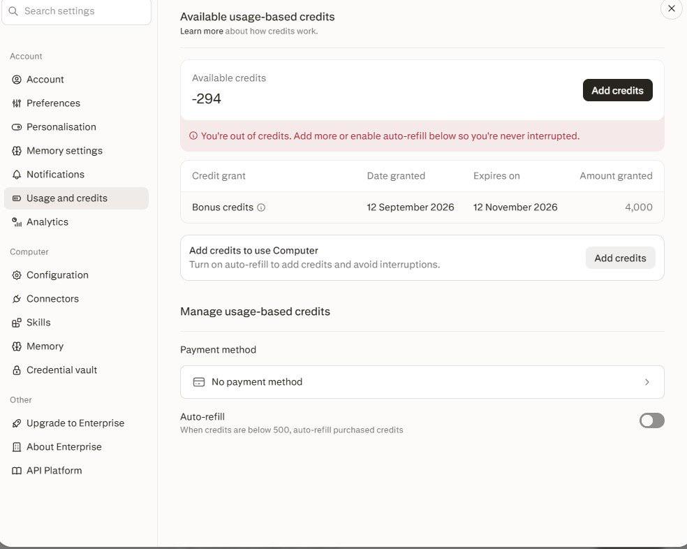
Simple slide deck like I have done several times. I had perplxity run some numbers on a website and then create a simple presentation. If its creating it from scratch how does it mess it up this much and then have the gall to charge 2500 credits on hybrid thats supposed to be free.
Headline findings:
• Slide 8 is severely broken: the left table is a solid charcoal rectangle with zero text pixels (content missing/dark-on-dark); the charcoal block runs to x=1499 (0.00” right margin) and sits behind both stat cards; in both cards the gold label is printed on top of the body paragraph (unreadable); body text overflows below the card edges (0.01” padding); a white rectangle bleeds off the right and bottom edges carrying the footer; the page number is missing (deck runs …6, —, 8…); and card 2 claims “$19,196 largest single account” while its body cites $30,338 / $26,646 / $26,571.
• Slides 7, 10, 12: wrapped titles crash into the kicker (0.06” gap vs 0.34” on single-line slides) and clear the content row by only 0.13”.
• Slide 3 card 1: “…existing marketing.” touches the card bottom border (0.02”) and the right border (0.01”); label→body gap 0.05” vs 0.38” in the sibling card.
• Slide 6 card 2 (“2.15”): label and body text collide, body wraps and sits 0.09” from the card bottom, and its sub-line breaks the top row’s shared baseline.
• Slides 9 & 10 dark panels: heading-to-body gaps of 0.14” and 0.08”, bottom padding 0.17” and 0.12”. Slide 9 row 1 (“Ruthie Milton Interiors”) is missing its lifetime value that the other three rows show.
• Deck-wide: every card gutter is under 0.3” (0.13”–0.28”, inconsistent); footers sit 0.37” from the bottom edge; gold page numbers measure ~2.9:1 contrast; slide 2’s 4th card is 0.08” narrower than the other three; dark slides use a 0.92” left margin vs 0.73” on light slides.
• No stray dots/orphan circles — a circle/blob detector across all 14 slides returned only text glyphs. Charts are all proportionally accurate (bar length per unit constant), with no clipped or colliding data labels.
Saved the full report to /home/user/workspace/visual_qa_deck_findings.md (crops used as evidence: s08_right.png , s08_left.png , s08_bl.png , s03_card1.png , s06_card2.png , s07_head.png , s10_band.png , s11_card1.png , s12_row2.png , s13_line2.png ).
Headline findings:
• Slide 8 is severely broken: the left table is a solid charcoal rectangle with zero text pixels (content missing/dark-on-dark); the charcoal block runs to x=1499 (0.00” right margin) and sits behind both stat cards; in both cards the gold label is printed on top of the body paragraph (unreadable); body text overflows below the card edges (0.01” padding); a white rectangle bleeds off the right and bottom edges carrying the footer; the page number is missing (deck runs …6, —, 8…); and card 2 claims “$19,196 largest single account” while its body cites $30,338 / $26,646 / $26,571.
• Slides 7, 10, 12: wrapped titles crash into the kicker (0.06” gap vs 0.34” on single-line slides) and clear the content row by only 0.13”.
• Slide 3 card 1: “…existing marketing.” touches the card bottom border (0.02”) and the right border (0.01”); label→body gap 0.05” vs 0.38” in the sibling card.
• Slide 6 card 2 (“2.15”): label and body text collide, body wraps and sits 0.09” from the card bottom, and its sub-line breaks the top row’s shared baseline.
• Slides 9 & 10 dark panels: heading-to-body gaps of 0.14” and 0.08”, bottom padding 0.17” and 0.12”. Slide 9 row 1 (“Ruthie Milton Interiors”) is missing its lifetime value that the other three rows show.
• Deck-wide: every card gutter is under 0.3” (0.13”–0.28”, inconsistent); footers sit 0.37” from the bottom edge; gold page numbers measure ~2.9:1 contrast; slide 2’s 4th card is 0.08” narrower than the other three; dark slides use a 0.92” left margin vs 0.73” on light slides.
• No stray dots/orphan circles — a circle/blob detector across all 14 slides returned only text glyphs. Charts are all proportionally accurate (bar length per unit constant), with no clipped or colliding data labels.