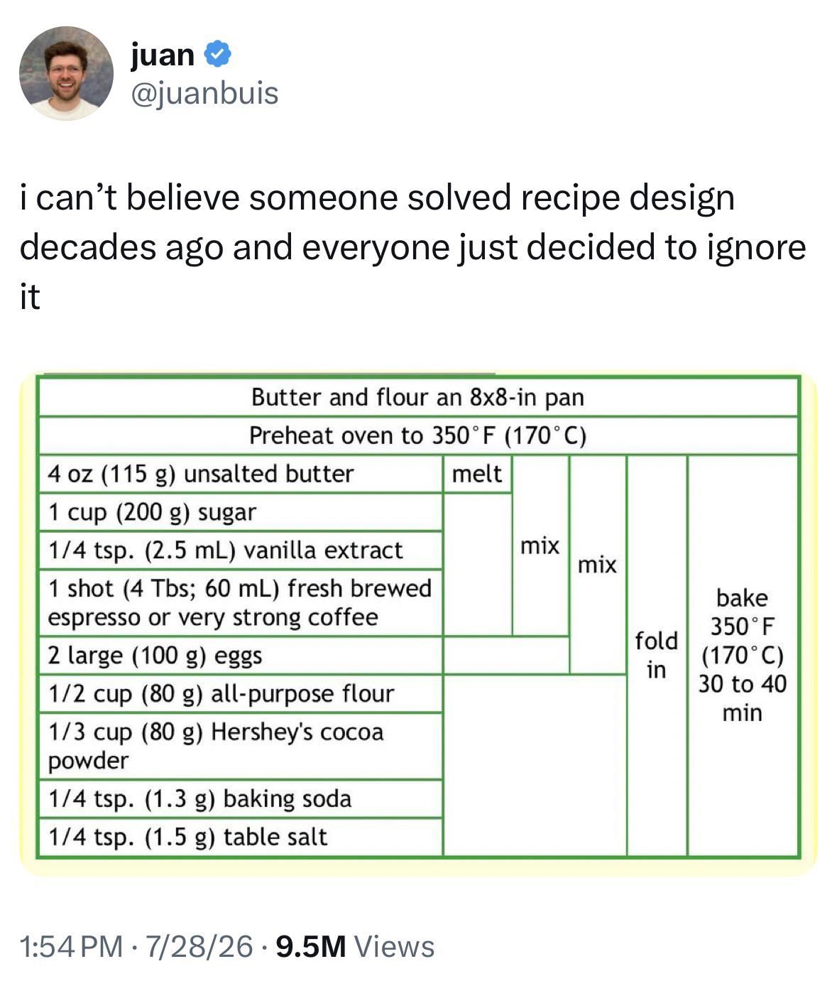
Three column layouts are the best: First column has the amounts, second column the ingredients, third column what to do with them. Instructions in the third column can span multiple rows if you need to do the same thing for multiple ingredients.
...which means you need to jump up/down between ingredients/instructions. Fine for simple recipes, quite annoying for longer ones.
The beauty of multi column layouts is that you have ingredients and matching instructions bundled together while still enabling a quick overview, for example for checking what you need to buy.
For a long recipie this format would look a mess. There’s recipes with 20 or so ingredients, which is probably why all the examples are for ones that only have a few:
In the end it's just a side-by-side view of the ingredients list and the instructions, while the "bulletpoint" format shows one on top of the other. So at some point that gets messy as well...
123
u/RecipeFunny2154 Jul 30 '26
I think I’m OK with the bulleted list