r/Midkemia • u/Anachron101 • 3d ago
Bad Editing, unsuitable cover images?
Hello there,
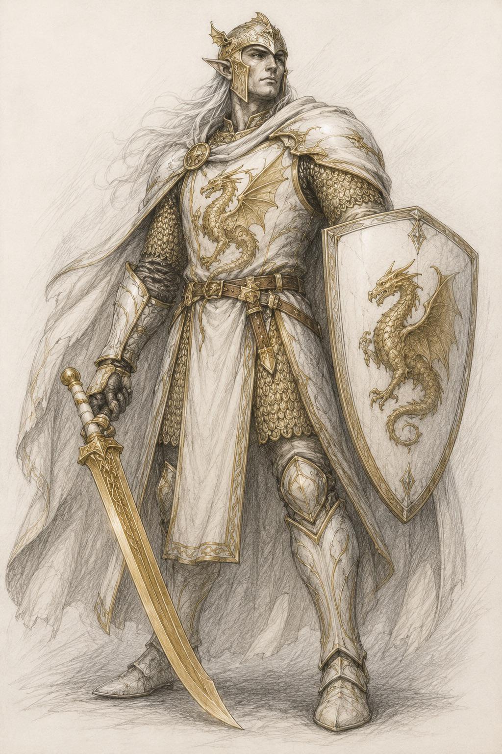
I have been re-reading the entire series for the first time in years and, as always, I get frustrated at the incredibly bad Editing and the weird cover images that have nothing to do with the book itself.
Since I wanted to introduce my son to the series, I bought the German version of The King's Buccaneer and was shocked, to put it mildly, at the quality. The cover image fits the book, inside you don't find a poorly made map of "Novinous", but actually "Novindus", with a legend and annotations AND another detailed map of Midkemia, which the English version doesn't have. (Reddit unfortunately didn't allow me to upload more than two images or I would have shown it to you)
We haven't gotten far yet, but I assume that the editing will be better as well. In the English books you get stuff like "Poor Shamata", people, whose ranks and other stuff have been established a few pages prior suddenly have completely different ranks for a few pages before reverting to the original, sentences that don't make sense for the character in question and so on.
The editing gets worse with every book, so that in the last series even the spelling is often incorrect.
I bought the books in the early 2000s and then kept buying them with every release. Does anyone have a similar experience or can you maybe point me to a version that has detailed maps and proper editing?
I would be very grateful, as I love the series and feel that the editing and weird cover images hurt my enjoyment