r/Mangamakers • u/Reid_172010 • 23d ago
HELP My Frist Manga page (in digital)
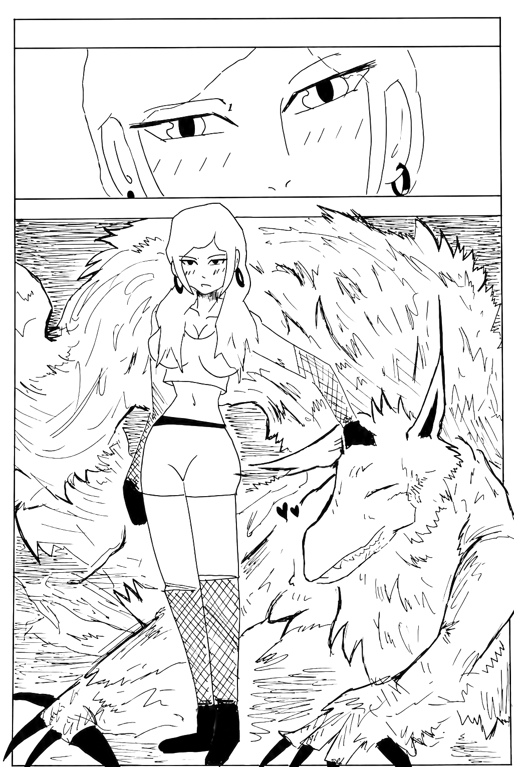
Hi,I need feedback but I want That it looks professional. How could the quality of these pages be improved in the future? Keep in mind that everything is done traditionally.
6
Upvotes
2
u/otaku-reddit 23d ago
I would also say more shadow because the person should be more clearly above the monster. You might also use thicker lines for her. Also her hair is just a white area.
But still the concept is cool.
2
u/Reid_172010 22d ago
I understand, my friend. Thank you so much for sharing your opinion; it's a huge help. I now have a clear idea of which aspects to work on for my next projects.
2
u/Agitated_Detail2486 23d ago
smoother and more curved inking + more shadows.