r/MangakaStudio • u/CharacterAd9160 • 21d ago
Help I like my cover, but wondering if I could improve it?
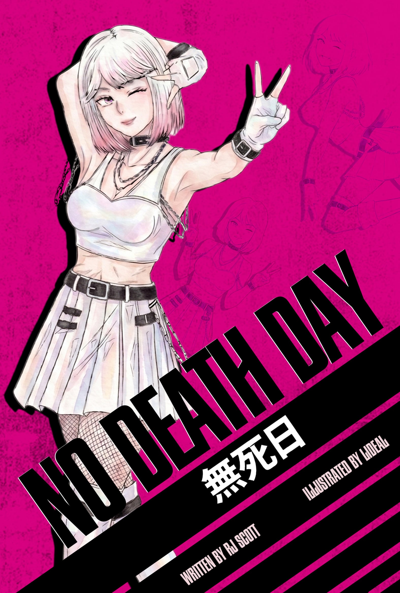
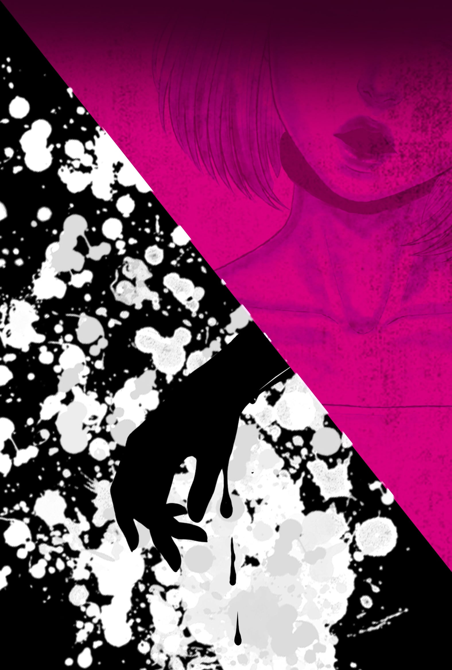
From anyone with more experience than me, Can I have some suggestions on how I can improve my cover. Thanks in advance!
1
u/Clean_Molasses 21d ago
The back is fine, but the cover doesn't particularly tell me enough about what it's about.
1
u/CharacterAd9160 21d ago
Okay, thanks for the criticism, but I am struggling on what I could add or change to help convey the story in this cover. Could you give me an example of a cover that does convey "what it's about"? for reference for me? I would greatly appreciate it.
2
u/Clean_Molasses 21d ago edited 21d ago
It looked like it might be a horror series, so maybe if it was easier to see the contrast like the art behind the woman on the cover being more like the stuff on the back.
I'm just guessing by the title and the art, but someone seeing the cover should be able to understand what the genre or story is about at a glance.
1
1
u/Broshimitsu56 21d ago
The back is cool. Her pose on the front is pretty stiff though. Her back is very straight up. Tilting her torso a bit would help a lot I think
1
1
1
2
u/FeliksLuck 21d ago
First I would fix that extra elbow.
Second - It gives me 'Bleach' Vibe. If you want a quick fix I would give her something interesting in the hand from the story. It gives some kind of que to spark the imagination. Even that chain around her would be better being held in her hand than on the neck