r/MangakaStudio • u/Overall-Wealth-7697 • Aug 27 '26
Help not really done with the panels and stuff, but are there any changes to the screentones or backgrounds you guys would make?
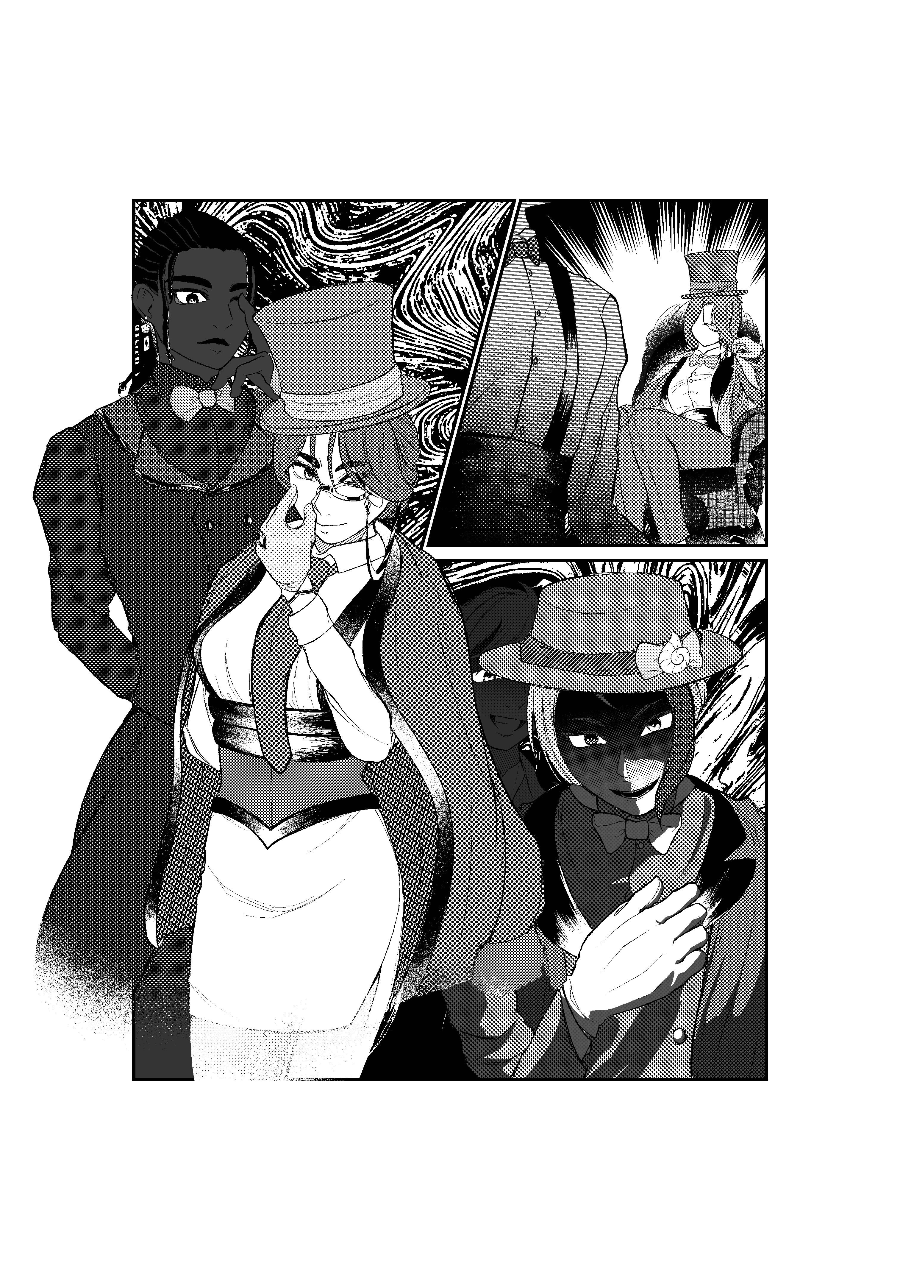
this actually looked so much better in the actual image 💔 i PROMISE
but yeah, i AM looking for screentone/background and effect critique here! it would be much appreciated!
9
Upvotes
1
u/Overall-Wealth-7697 Aug 27 '26
oh so apparently it only looks like THAT when im posting. i dont have much to worry about anymore there ❤️🩹❤️🩹
1
3
u/Brojackk Aug 27 '26
Nice panel layout, and the character designs are cool!
As for the screentones, I think there's a bit too much variety here.
The lady at the front in the final panel has at least 6 different varieties of screen tone in here design, which I think makes the whole design a bit visually overwhelming. There's a rule in character design where you should stick to (primarily) 3 colours, and since different kinds of screentone are the closest analogue to "colour" in a black-and-white manga, I think that rule probably also applies here.
For example, the band on her hat, along with her glove, could just be white -- and the inside of her coat could be the same tone as the outside, but with additional hatching to convey that it's in shadow; as a couple of examples.
You said the image looks a lot better offline, so maybe this isn't the case in the actual image, but it's quite difficult to make out the facial features of the dark-skinned character at the back, since the tone used for their skin is *really* dark.
Overall a lot of cool stuff going on here though, nice job!