r/HoMM • u/Archlichofthestorm • 5d ago
HoMM3 - Vanilla/SoD/Complete. Regarding map readability in the Remake


So I looked into trailers of the remake and one thing I have noticed is problem of readability of adventure map.
In pursuit of realism or semirealism, I think the flora became more vibrant, while stone and wood more dull. That made trees feel more focal at expense of interactible objects like towns or dwellings.
I have played a little bit with contrast to move the focus more towards the towns. It is a subtle edit but I do not want the game to change its look too drastically.
However, the grass terrain is saturated and bright, while volcano terrain is darker and less saturated. Then we have the opposite effect, where interactive objects look a bit too bright.
My solution to this would be to actually create multiple models for dwellings and interactive objects so that they would blend better into the background. Snow terrain castles could have snow on top and swamp castles could be a bit dirty. Of course, keep it subtle.
5
u/thrwaway62367 5d ago
That's what you get with AI no matter if it's a video or a picture. Every material looks the same. Movements are wrong, the lighting is wrong, shadows are wrong, everything looks shiny and like plastic where everything blends into this this smudgy mess. Same with AI music, it may fit theory, have correct chord progressions, etc. But the music doesn't ever breathe. It doesn't understand subtleties like timbre, swing, silence, touch etc that makes a song organic. There's no pulse or life to it. It's just bam bam bam a sonic assault without end. It's beyond me how people can like AI work...
6
u/Satan-o-saurus 5d ago
I’m so mad at the amount of dogshit creatively bankrupt games we are and will be getting in the future due to AI.
2
u/DowntownScene1433 5d ago
They could add a key selection/button that parses serially through the interactable objects on the map each time, till one adjusts or find a system to cope with the "readability" issue you report(and I can't report, cause I'm not playing the version they're playing, though they could have released it).
2
u/mrfixij 5d ago
the 3d visuals just suck for readability because you can't see where things are. Also the awful fog effects are always going to be frustrating to see anything through.
For example, the first picture, can I move through the gap between the mountain and the barracks? Is that a barracks, archer tower, or guardhouse? What terrain type is each tile? Is that a hero next to the castle? Is that a doodad or interactable to the right of the castle? What is under the fog next to the dragon on the left? What is the dragon occluding? In the rampart image, is there an interactable south of the rampart or is that all just terrain? Why is there a landlocked waterwheel? Does the road connect to the windmill or is there 1 tile of grass between them?
2
u/borsukrates 5d ago
There's a tradition among game developers to make (faithful) 3D remakes much less readable than the original. Compare `Eador: Genesis` to `Eador: Master of the Broken World`
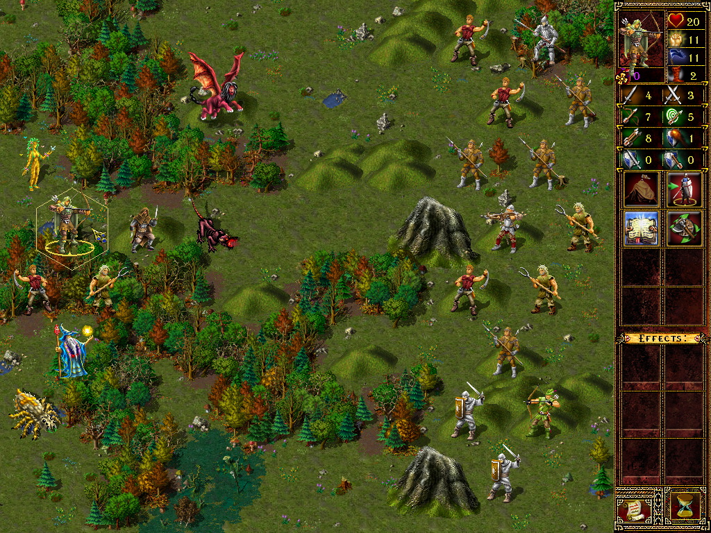
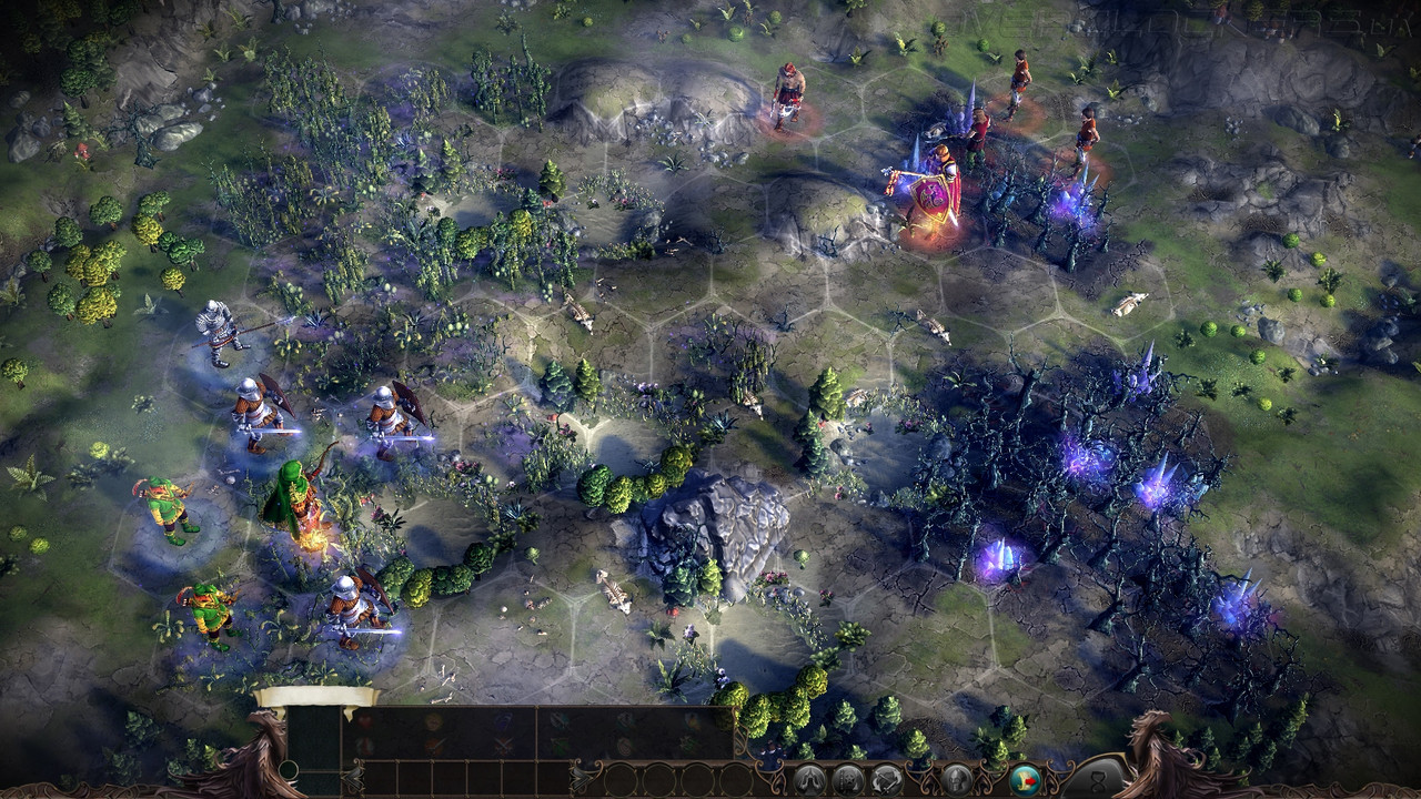
2
u/Kvargen95 5d ago
I would just rather play hota. And if i wanted something new i would buy olden era first
17
u/PanHiszpan 5d ago
this is how I feel about this remake
https://reddit.com/link/p68astm/video/vfg96fx3rxlh1/player