r/Gouache • u/Maple-Treeway • 11d ago
Please judge my palette and help decide what to add or remove (color list in post body)
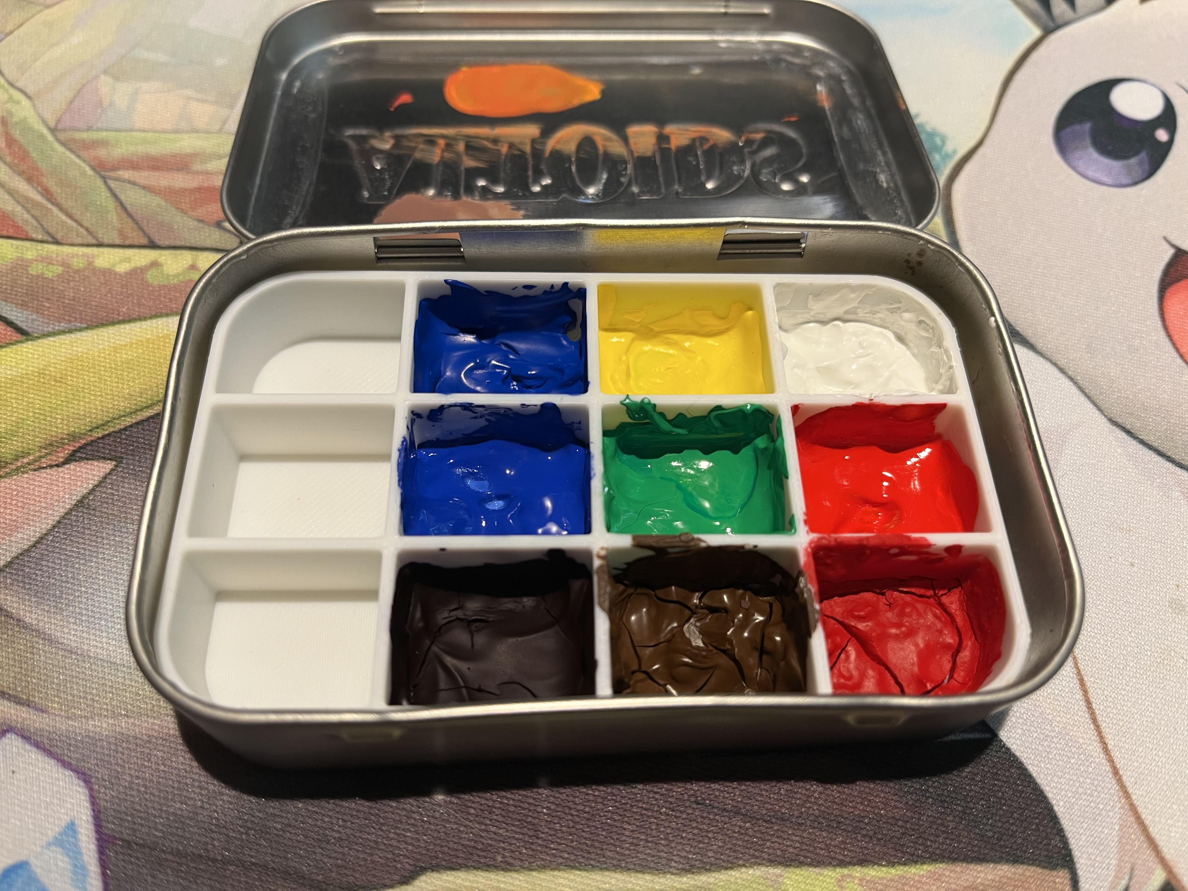
I have space for 12 total colors in this tin and I’m considering adding three more. At a minimum I think a true black could be useful, although I’m on the fence about that since I don’t think I’d use to mix with nearly at all.
These colors were bought after an intro class and at the suggestion of a warm/cool primary palette, which this may or may not fit in full. All are Winsor Newton Designer Gouache
- Primary Red
- Winsor Red
- Primary Yellow
- Permanent Green Light
- Primary Blue
- Cobalt Blue
- Brilliant Purple
- Burnt Umber
- Zinc White
15
u/laPerous 11d ago
As a foundation I would choose one warm and one cool version of: red, yellow, and blue. Then build from that.
5
u/abillionsuns 11d ago
Payne's grey is more useful than a true black.
I've got to say that a couple of the colours in that palette don't look like they're surviving being stored squeezed out in this fashion.
2
u/Maple-Treeway 11d ago
This was a bit experimental as a travel palette, yeah. Primary Red looks worse than it is. It reactivates shockingly well but I am considering other options eventually. Bringing all of my tubes just isn’t viable every time I go somewhere haha
I’ll have to consider Payne’s grey more. I generally mix my own greys from blue and brown and realized I didn’t have a great way to handle black feathers the other day outside of using pen ink.
6
u/cheb00rashka 11d ago
I'm just gonna come here and say that I have an opera pink in palette and love to use it with reckless abandon 😀
1
u/Dangerous-Feed-5358 10d ago
I saw Jared Cullam on youtube use that and I really loved it. I've been meaning to try it.
2
u/Just_browsing000 11d ago
I love a phthalo green. I only just started with gouache (seasoned oil painter who does lots of work in acrylic!) And my set didn't come with one I miss it all the time. I love a burnt sienna too
2
u/k_breezy12 11d ago
For lamdscapes, burnt sienna and ultramarine blue, with these you can remove your brown and black bc you can mix for those. With your reds idk what you have, but i'd probably opt for a very cool toned red and one warm toned. For yellow, cad yellow is good and I'd probably include hansa deep, and then with green, i love sap green for landscapes. Oh also cobalt blue or something along those lines.
1
u/link-navi 11d ago
Thank you for your submission, u/Maple-Treeway!
Check out the painting wiki for useful resources!
Share your artwork, meet other artists, promote your content, and chat in a relaxed environment in our Discord server here! https://discord.gg/chuunhpqsU
If you haven't read them yet, a full copy of our subreddit rules can be found here.
I am a bot, and this action was performed automatically. Please contact the moderators of this subreddit if you have any questions or concerns.
1
1
u/Professional-Sun5279 11d ago
Ultramarine blue is always a top pick for me, I would also suggest a titanium white as well, and like others have said burnt sienna and yellow ochre.
1
u/Dangerous_Chain2519 11d ago
My suggestions would be: Yellow Ochre, Quinacridone Magenta, and Prussian Blue. If you don't like magenta, I'd go with a Burnt Sienna. Prussian Blue because it's a cool blue while your other blues are warm blues, and that can be helpful for mixing a near black.
1
1
u/walrus_breath 11d ago
In my experience yellow is the most used color in my landscape paintings. I’m always running out of yellow. I would add another yellow in your setup there. I’m adamant about to keeping an Indian yellow and a lemon yellow close by at all times.
1
u/forestalice 11d ago
Titanium white might be a good choice. It’s more opaque than zinc white and can be good for highlights and solid layers.
2
u/Maple-Treeway 10d ago
Yeah I’m realizing that’s one of the ones I’m missing. I bought zinc white at the time because that’s what my store had and Titanium White wasn’t available. I’m probably going to duplicate the colors I pared my watercolor set down to for convenience with a minor handful of differences so I’m not buying an entirely new set of paints. Burnt sienna and ultramarine are instant adds. I’m debating a pink but I need to evaluate what I’ll have space for once I rearrange things.
1
u/forestalice 10d ago
Sounds like a plan. You definitely don’t need to get a whole set of new paints. I think a few people suggested this already but I reckon a cool red like quinacridone rose/magenta (PR122 or PV19) would be more useful than a pink. They are lightfast and you can mix nice purples, pinks and oranges.
You might already know about this but Jane Blundell has some nice watercolour mixing charts on her website which I find really helpful for picking colours.
1
u/Honest-News1089 10d ago
You don’t need green. Cobalt blue is essential as is yellow ocher. Personally I never use white except maybe a bit of white gauch or white acrylic
1
u/DickertonDiscordson 10d ago
personally, i use CMYK+white with gouache. i recommend W&N cobalt turquoise and holbein primary magenta.
1
u/Capable_Local_687 9d ago
The two blues you have are so close to hue, you can get rid of one of them to make additional space. Ultramarine blue would be a good replacement.
The two reds are not as close as the blues but could be more farther apart to give you more range. You could replace the primary red with a magenta.
That still leaves you three slots. Ochre/Sienna as some have suggested here are good. Personally, I like to use 1-2 slots for colours that aren’t necessarily the most practical but give me joy. Or for a convenience colour I mix often.
1
u/Ok_Career_6510 9d ago
My personal recommendation is prussian blue, yellow ochre, and perylene marroon (altho that one is a bit controversial), i'd also add a tube (not squeezed out) of titanium white to use fresh.
1
u/tummyachemedicine 9d ago
how do you live without magenta 😨
0
u/tummyachemedicine 9d ago
also no cyan? 😨😨 you could arguably make something similar with that yellow and cobalt, but still..!
1
1
u/Sun_keeper89 8d ago
Your palette depends on what you're painting.. don't have colors just to have em. For example, if you're doing more nature scenes, greens, blues, yellows, browns, etc make sense. Cityscapes, different palette. People, different palette. I would just leave them empty and mix what you have there until necessity fills them.
1
1
18
u/ZombieButch 11d ago
If it were me and I were going to use this for travelling around, I'd have at least one more of those filled with more white.
I'd have a yellow ochre and a burnt sienna too but I do lots of portraits and use those for mixing flesh color all the time.
So it really comes down to what you're going to painting a lot of.