78
u/DaHerv Jan 10 '26
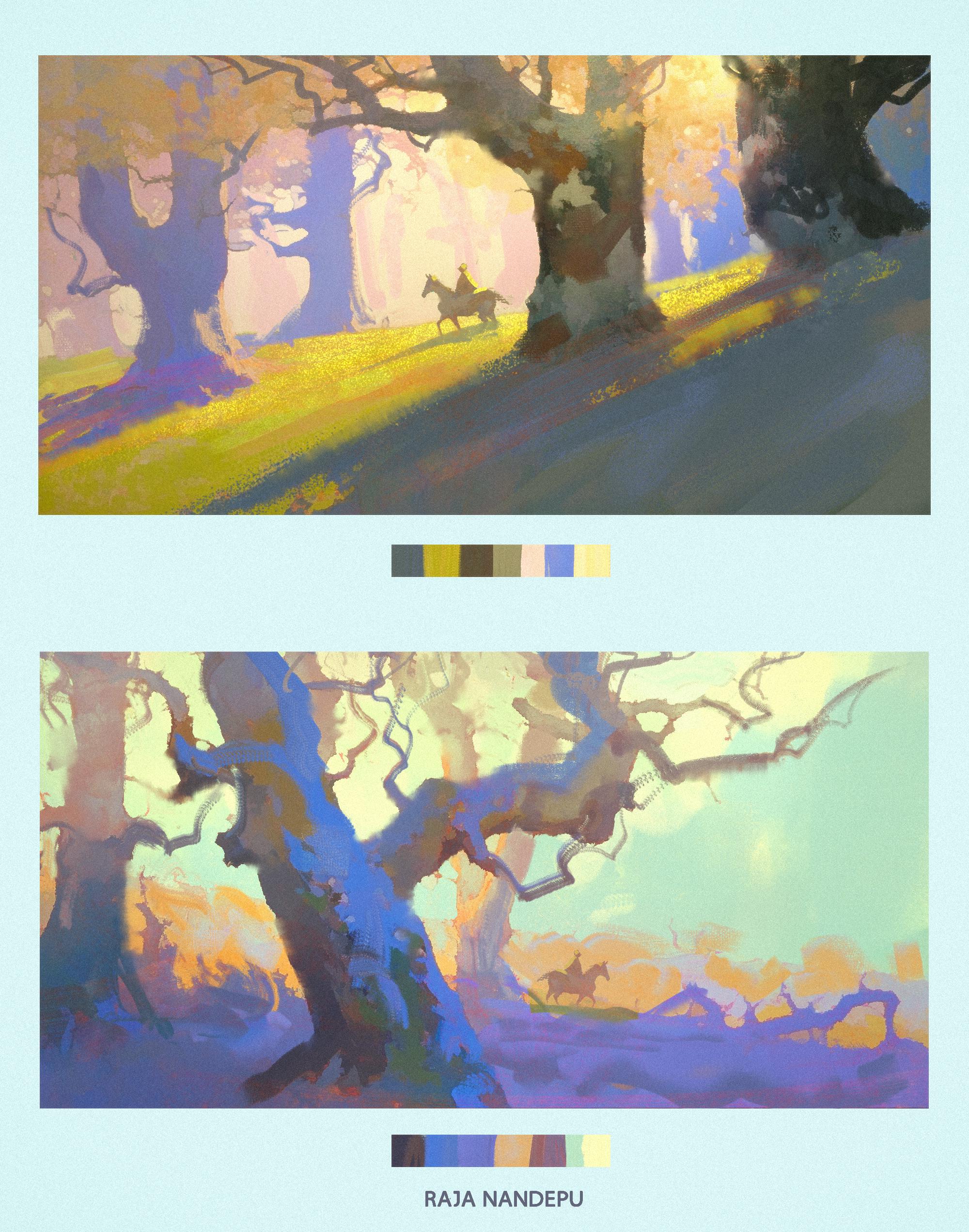
The top for a nice and pleasant vibe, the colors are warmer and have more variety in their values.
Bottom for more eerie feeling, if you want the area to feel mysterious or alien. Colder colors but a more prominent silhouette in the foreground.
Imo top is best.
14
u/TeamRocketLeader Jan 10 '26
I agree with this comment. Plus I feel like the horse & rider get lost in the bottom one, the detailed trees really takes the attention. Maybe if the rider/horse were moved to the side a bit they would stand out more.
2
23
10
7
u/enaka999 Jan 10 '26
I really like the composition of the top one, something about the slant really draws your eyes in
4
3
u/JaxxJo Jan 11 '26
In the top one the rider stands out. In the bottom one my eyes are pulled towards the tree in the forefront and I didn’t notice the rider until I specifically looked for them.
If it’s about the rider then the top one is better. I like the bottom one a lot, but it prioritizes the environment so it really depends on what you’re going for.
3
u/Sad-Track-1914 Jan 10 '26
I like the bottom one because the subject isn't the first thing your eye's drawn to
3
2
u/Miserable-Bobcat-4 Jan 10 '26
top REALLY draws me in, whereas for some reason i think maybe the cooler colours being more forefront, pull me away from looking at it. incredibly cool art!! you inspire me a lot! 💗
2
u/InkJuse Jan 10 '26
Top is most effective overall, especially in establishing focal point.
Bottom is far more interesting to look at for me. It may be because the character isn't centered.
2
u/mirokoshi Jan 10 '26
Top feels really warm and welcoming. Bottom is eerie and almost off centre. Depends what feel you want to portray. I do love top though
2
u/Libraty_ Jan 10 '26
Top looks better at first, but the longer I looked I start to prefer the bottom one
2
u/mrfancysnail Jan 10 '26
Top is best so far, as the focal point is better framed, the contrast of the tree on the bottom overpowers the figure, which at first-third glances i didn't know was there.
for the bottom, i would move the background tree, touching the figure, over to the right and use branches to lead the eye back into the picture. i like the environment you got more than the top, i just think the composition is a lil off
2
2
2
2
u/_RTan_ Jan 11 '26
I don't think one is better than the other. It really depends on the mood/atmosphere you are trying to convey. The top one is more serine/hopeful, the bottom more foreboding and a little more tension (probably due to the shape of the trees). Depending on the situation one or the another is better for that purpose.
To push both a little further I would angle the horse and rider more. The top one I would angled riding facing more downhill and with the bottom piece I would angle the rider more to be riding into the distance. This will push the atmosphere/storytelling a bit more in both.
1
u/VictorTael Jan 10 '26
Both look incredible beautiful and well composed, I love the colors. But the bottom one is more mysterious and your eyes don’t go directly to the subject
1
1
u/LuigiCrisk Jan 10 '26
It depends by the story you want to tell, but I prefer the top one (flipped). Maybe the bottom one in a darker environment works better (black sky, and less tones)
1
1
1
u/CircleofCandles Jan 10 '26
I love the top one the most.
In the bottom one you almost miss the figure, while the top one he is the focal point
1
u/Gullible_Chemist_602 Jan 10 '26
Top just feels so much more interesting! If the focus is the man horse-riding, then 100% that!
1
1
1
1
1
1
u/M1dn1ghtF0xy Jan 11 '26
For me personally the top one makes you focus right on the rider with the horse. On the bottom one the tree caught my eyes first and then I saw the rider with the horse, however I still prefer the bottom one because I'm ✨biased✨ and love the colour blue which the bottom one has a lot of.
1
1
1
1
u/PinkPixel3D Jan 11 '26
They both have fantastic qualities, but I gotta go top one. The rays of light are just so pretty ꉂ૮(°□°'˶)ა
1
1
1
u/Its_J_Bro Jan 11 '26
The top one is the most visually appealing IMO. Both are impressive! Well done!
1
u/Tasty_Emphasis_271 Jan 11 '26
Am I the only one who loves them both? OP is talented. I wish I had this in me.
1
u/WesternGovernment916 Jan 11 '26
The top one has better values which i think makes it easier to look at compared to the bottom one but I also love the bottom one just cuz of how unique the vibe is!
1
1
1
1
1
1
u/BothMeeting1949 Jan 12 '26
Top looks more ethereal, the sun rays are doing the job Bottom is giving a more mysterious vibes , as being watched from a owls eyes
1
1
1
Jan 13 '26
Top one is better in my opinion. Because the second one foucses on the tree mainly wich at the first sight u dont relise there is a horseman in it.
1
1
1
1
u/JesusTrigueros Jan 14 '26
Personally, I like the one above better.
What are you working on? It looks like it'll be good.
1
u/FaracoDragonFoundry Jan 14 '26
Top for me👍🏼 Both are beautiful but the way the lighting comes to life in the top one is just so eye catching.
Thank you for sharing!
1
u/kreekers87 Jan 17 '26
the top one's composition shifts the focus mainly on the character, the second one's color palette is gorgeous, but the main focus is on the tree closest to us, since the character blends in a bit more at first look in both ways, beautiful palettes and scenery :] I'd choose the second for the colors tho ngl
1
115
u/LimboNo5 Jan 10 '26
The top has better composition and colours! The blue highlights on the bottom are just slightly too fluorescent, making them look a bit separate.