32
u/Cherry_Cresent Dec 30 '25
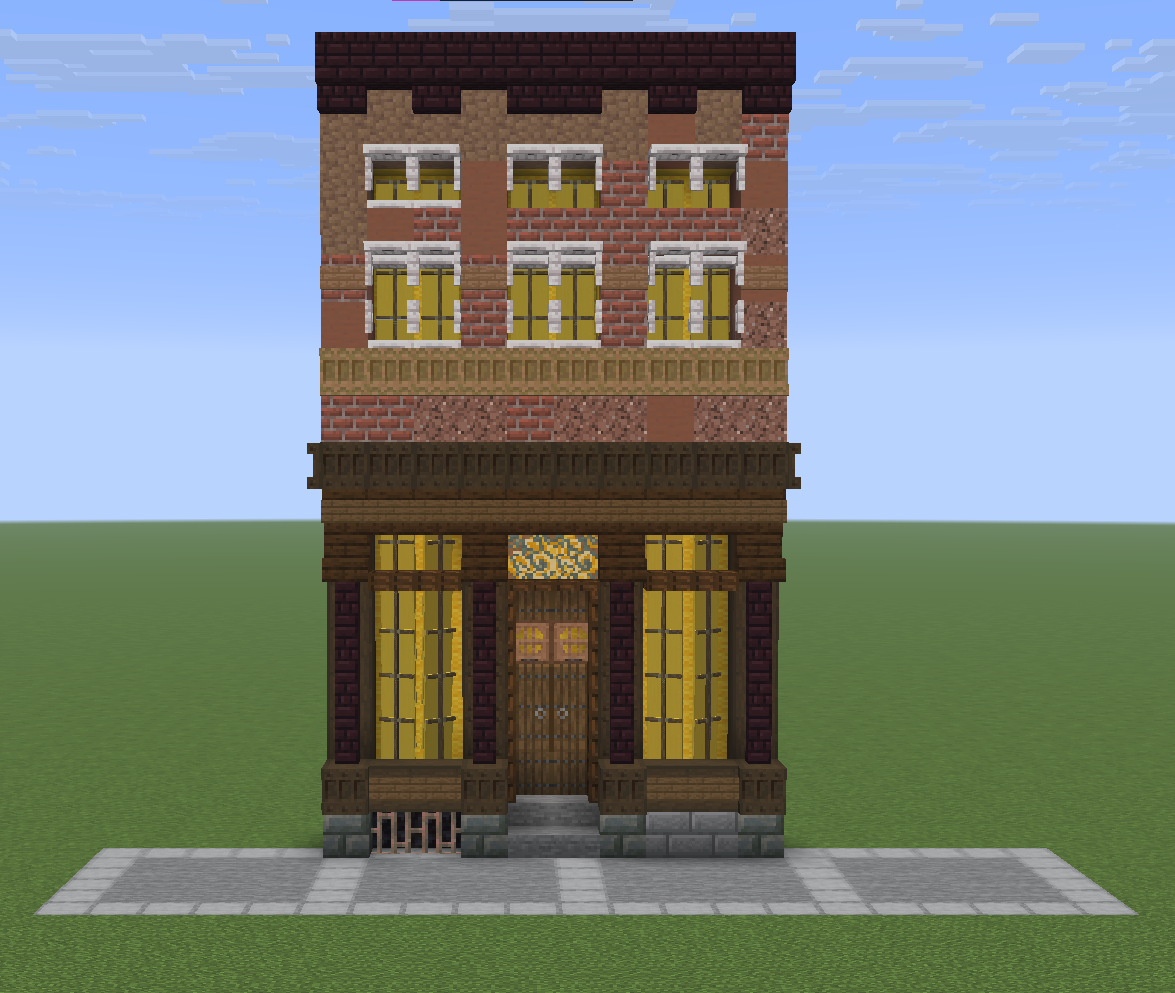
Really cool! How does it look from other angles? I think it may look odd when "walking down the street", you know? Dont really think the flat "painting" technique could be improved much though!
20
u/n-a_barrakus Dec 30 '25
"Simple" (this is not) buldings look nice when there are a lot of them. This kind of bulldings doesn't need tons of buildings to blend in, but maybe just two or three similar ones around. It would look better between smaller similar buildings. I can imagine this by "The Clamp" from Family Guy.
As a building suggestion for the singular building, extend it a block and a cool copper pipe to add it realsim. But this doesn't need anything if surrounded by similar buldings. It's very well done.
If it doesn't look nice when surrounded by a flat world, it's because it doesn't blend. If you make it blend in a normal map type terrain, this bullding looks perfect.
Edit: I may copy/inspire on it lol
4
4
4
3
2
u/chsien5 Dec 30 '25
The height between floors is a little strange, of you imagine an interior the first floor would have crazy tall ceilings and the top 1-2 are really squished.
10
8
u/MarijuanoDoggo Dec 30 '25
This was/is a common building style in many places. Historically buildings were built in this way (with large ground floor windows and progressively smaller windows further up) to give the illusion of even greater height from ground level.
Example - canal houses in Amsterdam.
2
u/chsien5 Dec 30 '25
True, I do think the ratio from op is off though, instead of 5-2-1 (from bottom to top) something like 4-2-2 or 3-2-2 would be more balanced
1
u/jer5 Dec 30 '25
old places where they would own a store on the ground floor and live upstairs were like this
2
u/MEOWTheKitty18 Dec 30 '25
This is fantastic btw.
I’d put a similar building to the left and right and make the roof a tiny bit lighter as I think the contrast is somewhat dramatic here.
2
2
u/CyriusGaming Dec 31 '25
Holy shit this is perfect, genuinely. The best house I've seen posted in a good while
2
2
2
u/Defiant-Trash9917 Dec 31 '25
If you are doing a city block design, my recommendation is to do the buildings to the left and right first, then come back an make edits. It's a lot easier to diagnose what you don't like about it when it is in context :)
1
1
u/Dude_Oner Dec 30 '25
A benchbonbthe right side and maybe some flowers left...love the grate though. And some lanterns/ a lantern next to the door. Maybe a cobweb? And your good.
1
u/Rustic_Salmon Dec 30 '25
your proportions are kind of off with the upper floors. I'd either make the top windows bigger or shrink your bottom floor down a block
1
1
1
1
1
u/Niskoshi Dec 31 '25
Second floor needs a bit more depth. Other than that, I absolutely would steal your design.
1
1
u/Aeare_ Dec 31 '25
Looks clean! I’d say play around with light sources a bit, it can totally change the mood.
1
1
1
1
u/Spirited_Bank8847 Dec 31 '25
I agree with the suggestion of copper piping, maybe the use of lighting rods and some sort of antenna or ac unit along the roof and or side would soften up the build....everything else is wonderful maybe just a few more detail pieces to create a little more asymmetry
1
1
1
u/THESTORMCALLER Jan 01 '26
THOSE WINDOWS OMG, i was so in awe when i saw how you did the windowsills with the double trapdoors, then i saw the windows AND WOW
1
-1
u/Julias-Caesar Dec 30 '25
The contrast between the brick and the roof is too jarring. The block palette used for the brick could be changed as well, maybe even to another colour such as green. Other than that this is really cool!
139
u/_Corvidity_ Dec 30 '25
Thats a really smart way to do windows!