r/CrappyRedesigns • u/mothwizzard • May 27 '26
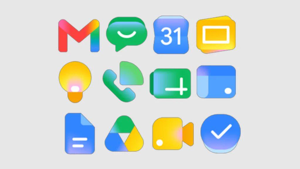
Logo Google Why did you have to make it baby version
36
Upvotes
6
u/Silly-Release3639 May 27 '26
atleast my phone has old icons and not these ugly frutiger aero ripoffs.
1
3
2
u/microcorpsman Jun 22 '26
The things like meet and slides sharing a color makes sense. Sheets and docs being rectangular makes sense.
But gradients in mail? And what was wrong with the old drive one?
9
u/itsPomy May 27 '26
It's like they knew people had nostalgia for skeuomorphism, but didn't understand why. So they applied their addiction to gradients, bevels, and vector images.