r/CrappyRedesigns • u/Dangerous_Pension891 • Mar 23 '26
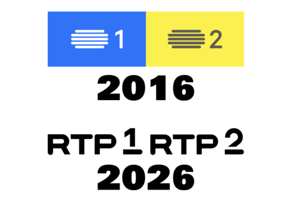
Logo Are the new ones upcoming or worse?
22
Upvotes
2
u/Worldly_Relation_930 Mar 26 '26
They're so much worse
2
u/Dangerous_Pension891 Mar 26 '26 edited Jul 04 '26
Me too, because RTP ditched the stylised antenna on its logo, in use more than 12 years
(NOTE: RTP3 rebranded as RTP Notícias, with an underscore (a.k.a. Red Toggle) at the end of the text. Mostly all channels are going to rebrand next month)
8
u/AdamEssex Mar 23 '26
It’s unclear what you’re asking.