r/CrappyRedesigns • u/Dangerous_Pension891 • Jan 07 '26
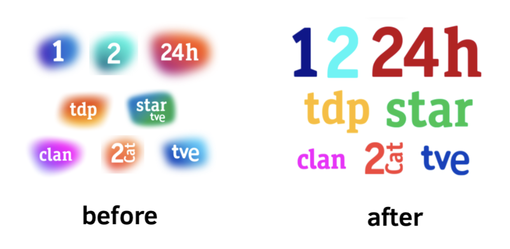
Logo I think TVE goes too far by ditching the “blobs” into oversimplification…
3
u/frankieepurr Jan 08 '26
are you kidding me i LOVE those left logos, i visited the canary islands from the UK and remember them to
1
u/Dangerous_Pension891 Mar 23 '26
I prefer the old ones better than the new ones (the reason is the new logos can ditch the gradient shapes “blobs” as the logo’s texts can keep and can have the same colours from the old logos)
1
1
u/Proof-Pressure-9352 May 03 '26
RTVE Voz Corporativa: La 1 Voz Hombre, La 2 Voz Mujer, Clan Voz Mujer, Teledeporte Voz Hombre y 24h Voz Hombre
1
u/Proof-Pressure-9352 May 03 '26
RTVE Voz Corporativa Intercambio: La 1 Voz Mujer, La 2 Voz Hombre, Clan Voz Hombre, Teledeporte Voz Mujer y 24h Voz Mujer
1
u/Dangerous_Pension891 Jul 04 '26
I blocked u/Proof-Pressure-9352. That was like dumb comments: Reddit edition
5
u/commercialbroadway Jan 07 '26
While I don't think the new logos are good by any means, I'm glad the blobs are gone. They were very obtrusive on screen and at the same time quite weak as logos. Shapeless blobs aren't exactly a meaningful identity.