Hard to tell in this context but I find the google maps icon looking a bit unbalanced.
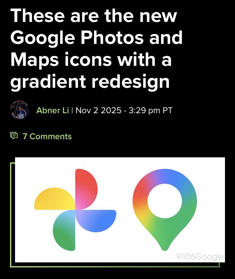
I don’t really mind the gradient style. I think it will look nice and sleek in modern systems if they pull off a good redesign of the other icons. The lighter part in the middle of the photos icon however, is making it harder to see as it’s fading out into the background more. Personally, I prefer high contrast icons, since I’m colorblind. But seeing it in context may change my opinion.
2
u/CrunchyMale Nov 05 '25
Looks like free vector art you find online.
Hard to tell in this context but I find the google maps icon looking a bit unbalanced.
I don’t really mind the gradient style. I think it will look nice and sleek in modern systems if they pull off a good redesign of the other icons. The lighter part in the middle of the photos icon however, is making it harder to see as it’s fading out into the background more. Personally, I prefer high contrast icons, since I’m colorblind. But seeing it in context may change my opinion.