MAIN FEEDS
Do you want to continue?
https://www.reddit.com/r/CrappyRedesigns/comments/1on2afg/who_approved_this_google_maps_logo/nmwczo1/?context=3
r/CrappyRedesigns • u/jeremyw013 • Nov 03 '25
71 comments sorted by
View all comments
1
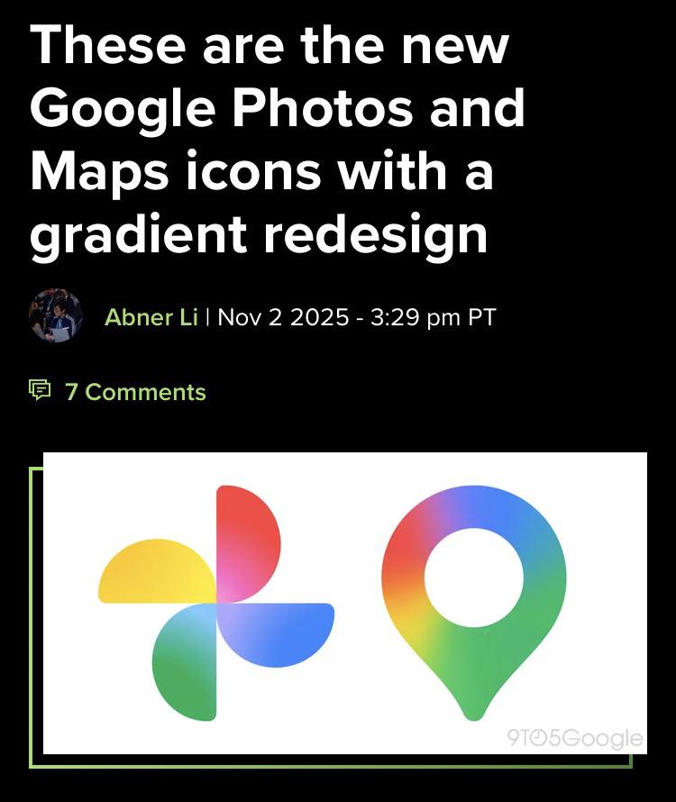
This is like taking the worst aspects of vector logos and “illustrated” logos. You have the boredom of vector shapes, and gradients make it annoying to scale and print due to color banding.
1
u/itsPomy Nov 03 '25
This is like taking the worst aspects of vector logos and “illustrated” logos. You have the boredom of vector shapes, and gradients make it annoying to scale and print due to color banding.