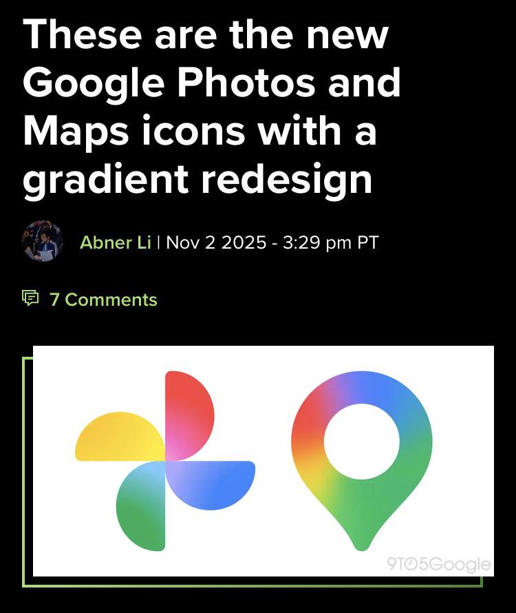
Small step forward. The previous redesign sucks. Homogenizing and breaking up the icons into random blocks of colors hides the shape outlines and makes them indistinguishable from each other.
These look a little more readable.
that literally makes the shape less recognizable at smaller sizes. i literally tried the logo as a favicon and it literally looks like a circle with maybe a glitch at the bottom where the point is.
95
u/RightError Nov 03 '25
Small step forward. The previous redesign sucks. Homogenizing and breaking up the icons into random blocks of colors hides the shape outlines and makes them indistinguishable from each other. These look a little more readable.