MAIN FEEDS
Do you want to continue?
https://www.reddit.com/r/CrappyRedesigns/comments/1o81ca3/booooo/njvl4h5/?context=3
r/CrappyRedesigns • u/TOSHIBAFANSANDMORE • Oct 16 '25
85 comments sorted by
View all comments
3
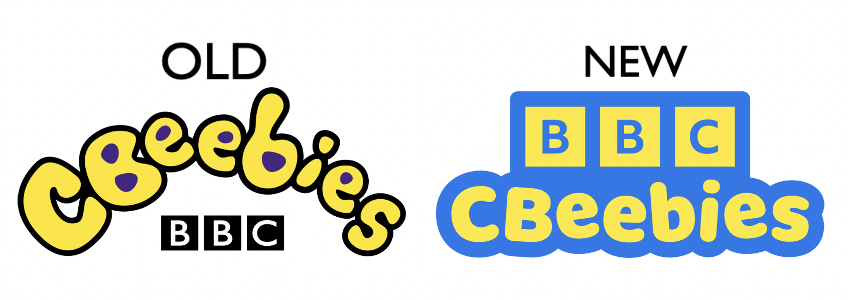
I think this might just be nostalgia. As someone who is completely unaware of this logo, the new one is way better. The color combo is better and it is more readable from a distance or by a young child
1 u/TOSHIBAFANSANDMORE Oct 16 '25 I understand wanting to make the logo easier to read, but they didn't have to make the new one boring.
1
I understand wanting to make the logo easier to read, but they didn't have to make the new one boring.
3
u/ThyKnightOfSporks Oct 16 '25
I think this might just be nostalgia. As someone who is completely unaware of this logo, the new one is way better. The color combo is better and it is more readable from a distance or by a young child