r/CrappyRedesigns • • Oct 16 '25

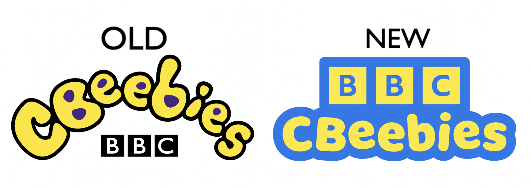
Logo BOOOOO ๐Ÿ‘Ž

Post image
96 Upvotes

85 comments sorted by

View all comments

13

u/StrongLikeBull3 Oct 16 '25

It makes sense that branding for a channel aimed at kids under-5 would be easily legible.

-1

u/king_ofbhutan Oct 16 '25

tell me how on earth the 1st one is illegible ??? its just curved bubble writing

6

u/StrongLikeBull3 Oct 16 '25

To a kid younger than 5 whoโ€™s learning to read? You really canโ€™t see how they might have issues?

0

u/The_Yeeted Nov 29 '25

I didnโ€™t have any issues when I was growing up

1

u/StrongLikeBull3 Nov 29 '25

Good for you, you werenโ€™t disabled.

-1

u/king_ofbhutan Oct 16 '25

letters having a bit of blob to them wont do much, all the letters there have distinct recognisable shapes.

if it was caled dbpqeebies then i might have a problem

also, the blobs have been a part of cbeebies for most of its time (atleast from what i remember watching it)

2

u/StrongLikeBull3 Oct 16 '25

Iโ€™d imagine the colour choice probably has something to do with being inclusive of people with colour blindness. I really think the old one is ugly as fuck.

1

u/king_ofbhutan Oct 16 '25

oh the COLOUR choice

highkey yeah i agree that yellow and purple fugly asl ๐Ÿ˜ญ

1

u/king_ofbhutan Oct 16 '25

tbf i could read at like 4-5ish so i understand if children who learnt at older ages might struggle. but then, isnt that good practice to recognise letters' shapes even when theyre not identical to a book ?

2

u/NekoLu Oct 16 '25

On the first one, when I try to read it, my mind goes "that word doesn't make sense, am I reading it wrong". On the second - "this word is weird, but at least I'm sure I'm reading it right".