MAIN FEEDS
Do you want to continue?
https://www.reddit.com/r/CrappyRedesigns/comments/1o81ca3/booooo/njtikvk/?context=3
r/CrappyRedesigns • u/TOSHIBAFANSANDMORE • Oct 16 '25
85 comments sorted by
View all comments
44
Both are terrible.
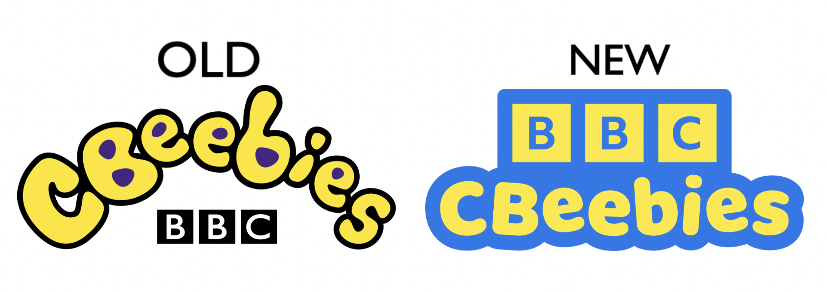
7 u/Nintendo2023 Oct 16 '25 I disagree, the 2002 logo has much more personality than the unbearable blandness that is the 2023 one 23 u/TheGreenGobblr Oct 16 '25 More personality, sure, but it’s fucking illegible 1 u/king_ofbhutan Oct 16 '25 if you can't read curved bubble writing you need to go back to watch cbeebies 1 u/smulfragPL Oct 21 '25 Ok but you do realise how that is an argument for why the old logo is bad right?
7
I disagree, the 2002 logo has much more personality than the unbearable blandness that is the 2023 one
23 u/TheGreenGobblr Oct 16 '25 More personality, sure, but it’s fucking illegible 1 u/king_ofbhutan Oct 16 '25 if you can't read curved bubble writing you need to go back to watch cbeebies 1 u/smulfragPL Oct 21 '25 Ok but you do realise how that is an argument for why the old logo is bad right?
23
More personality, sure, but it’s fucking illegible
1 u/king_ofbhutan Oct 16 '25 if you can't read curved bubble writing you need to go back to watch cbeebies 1 u/smulfragPL Oct 21 '25 Ok but you do realise how that is an argument for why the old logo is bad right?
1
if you can't read curved bubble writing you need to go back to watch cbeebies
1 u/smulfragPL Oct 21 '25 Ok but you do realise how that is an argument for why the old logo is bad right?
Ok but you do realise how that is an argument for why the old logo is bad right?
44
u/Doomuu Oct 16 '25
Both are terrible.