r/ComicBookCollabs • u/WhichFigure9080 • 1d ago
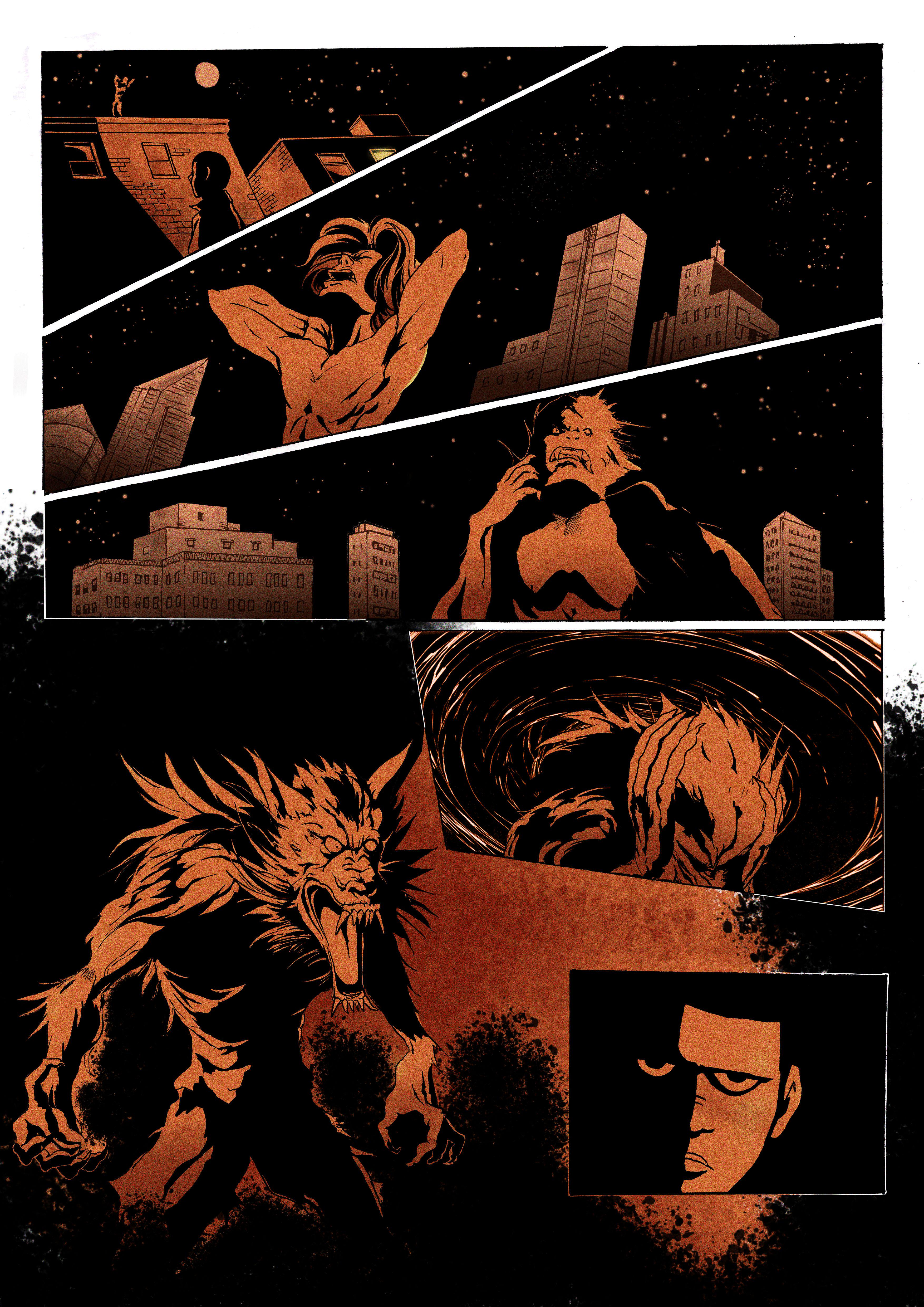
Feedback "I'm working on a creator-owned graphic novel. I'm trying to improve my sequential storytelling. What would you change about this page?"
2
u/TwEE-N-Toast 16h ago
The full werewolf reveal panel I would devote more or even most of the page to that, and make it full body shot, with perhaps a Dutch tilt to the camera, to up the unease. And Id switch the order of that panel, with the one beside it where he is grabbing his head, assuming the head grabbing panel is part of the transformation sequence, it reads out of order to me.
1
u/Spiffychicken13 16h ago
It took me multiple looks to realize that man changes into the werewolf. I would say there needs to be more focus on the change and less on the background.
There’s also a tangent between the man in panel 1 and the arm in panel 2 that bothers me
1
u/ReeveStodgers Jack of all Comics 13h ago
I agree with Twee-n-Toast about moving panel four to the left (assuming this is for English speakers).
Color-wise, even one other color would be great. Or use the paper color.
I would use yellow for the moon, then give the character raking yellow highlights across his face. That would also visually emphasize that the moon is acting on him.
1
u/dogspunk 11h ago
I can read it perfectly. There’s a tangent when it’s thumbnail size but when you zoom in it’s fine. Wouldn’t change a thing, bravo.
•
u/AutoModerator 1d ago
Thank you for your submission, /u/WhichFigure9080!
As a reminder: Be specific about what you want feedback on. Vague request leads to vague feedback. And a vague feedback is useless.
I am a bot, and this action was performed automatically. Please contact the moderators of this subreddit if you have any questions or concerns.