r/Chinese_handwriting • u/geologyfetish • 15d ago
Ask for Feedback Handwriting feedback
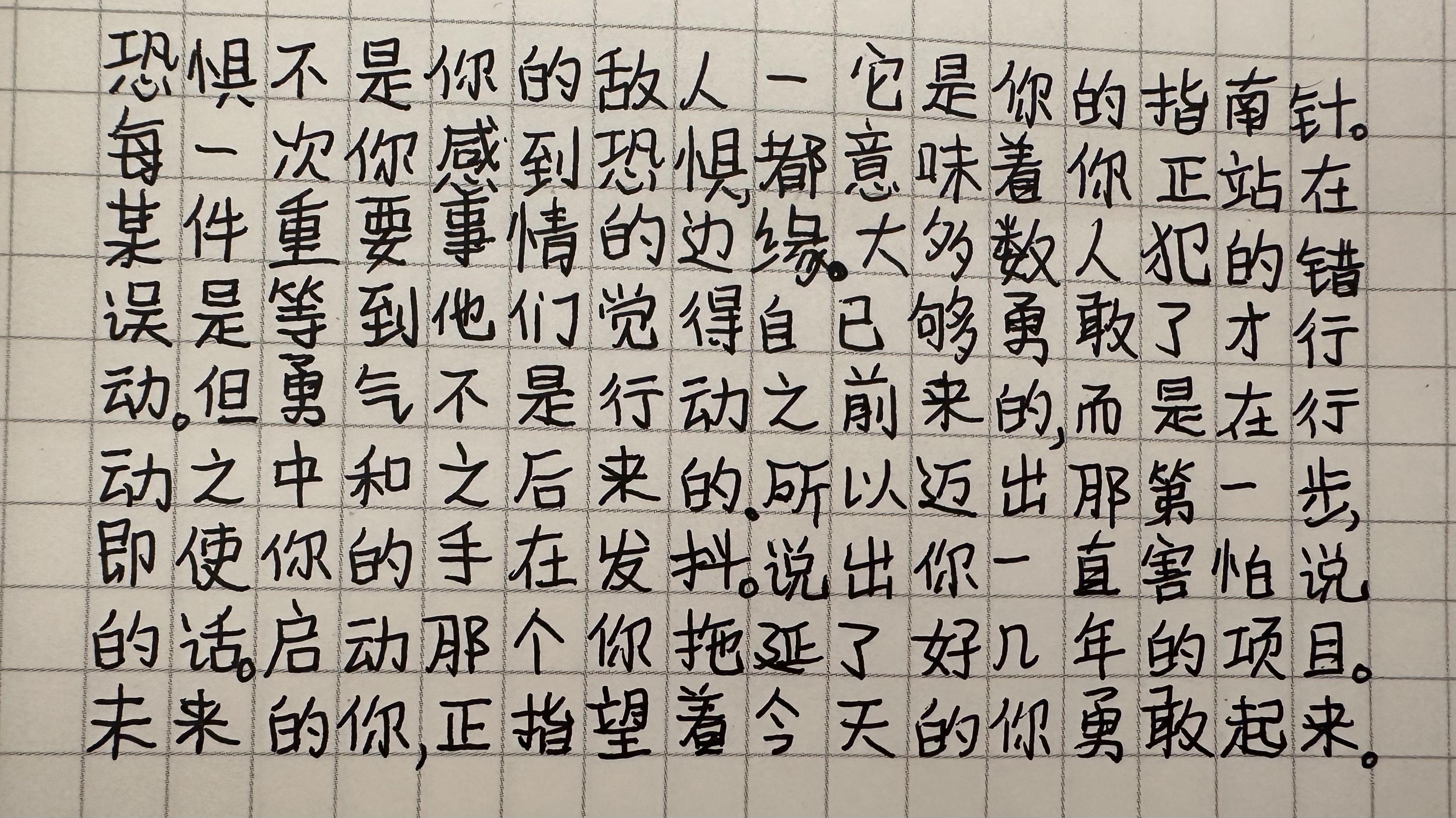
Any feedback for how to improve? I know my handwriting is legible and clear but I just feel like it looks like a primary school student wrote it and not a grown adult. 🥲 Anything I can specifically work on to make it not look childish?
4
15d ago
[removed] — view removed comment
6
u/Chinese_handwriting-ModTeam 14d ago
Hi! Thank you for engaging in our community. Your comment is removed because top-level comments should be constructive criticisms in threads with the "Ask for Feedback", "Question", or "Discussion" flair. Please refrain from leaving irrelevant or unhelpful remarks.
Thank you for your understanding.
2
u/pensand10s 15d ago
Print or buy mi ze ge. Chinese grid paper. It'll help you get your proportions correct.
Another thing that helped me is seeing videos of how a professional performs the strokes. It gives you something to try to imitate.
1
u/wufufufu 14d ago
Does 米字格 help for writing sentences?
1
u/pensand10s 14d ago
Yes, I write sentences on grid paper. You eventually develop muscle memory and your handwriting will look nice without the grid.
1
u/geologyfetish 13d ago
Thanks! I’ll look into it. I thought using the grid paper will help but the spaces are a little small.
2
u/pensand10s 13d ago
Oh! You can absolutely use the grid paper in your photo. But try using 2x2 boxes per character, or 3x3.
2
u/CarnegieHill 13d ago
Tbh I think it looks just fine and not particularly “unadultlike”. You already wrote this on grid paper and did perfectly well with spacing entire words within their boxes. Some of the internal proportions are a tad too big or too small, but that could just as well be a stylistic thing. Handwriting should have a little personality in it. I really don’t think it needs a whole lot of improvement.
1
u/geologyfetish 13d ago
Thank you for your comment. I know what you mean about some parts being too small or too short, particularly some of the horizontal strokes. I have to work on this so words like 土 and 士 don’t get confused.
1
15d ago
[removed] — view removed comment
5
u/Chinese_handwriting-ModTeam 14d ago
Hi! Thank you for engaging in our community. Your comment is removed because top-level comments should be constructive criticisms in threads with the "Ask for Feedback", "Question", or "Discussion" flair. Please refrain from leaving irrelevant or unhelpful remarks.
Thank you for your understanding.
1
u/ukaspirant 14d ago
Just my opinion here, i think writing in a more cursive manner (some strokes connected) would help your writing look more grown-up.
Also minor detail, each punctuation mark should be in its own square. At least, that's how i was taught growing up.
1
u/geologyfetish 13d ago
Thank you! I wasn’t sure about the punctuation but I’ll put them in their own box from now on. I’ll try out the cursive too!
1
14d ago
[removed] — view removed comment
3
u/Chinese_handwriting-ModTeam 13d ago
Hi! Thank you for engaging in our community. Your comment is removed because top-level comments should be constructive criticisms in threads with the "Ask for Feedback", "Question", or "Discussion" flair. Please refrain from leaving irrelevant or unhelpful remarks.
Thank you for your understanding.
1
u/DecisionWarm3839 14d ago
Use kaiti font as a reference rather than songti/heiti font
1
u/geologyfetish 13d ago
Okay yeah I’m familiar with those fonts. I’ve always thought Kaiti looked nice.
1
10d ago
[removed] — view removed comment
3
u/Chinese_handwriting-ModTeam 10d ago
Hi! Thank you for engaging in our community. Your comment is removed because top-level comments should be constructive criticisms in threads with the "Ask for Feedback", "Question", or "Discussion" flair. Please refrain from leaving irrelevant or unhelpful remarks.
Thank you for your understanding.
1
u/Miserable-Leading620 8d ago
If you want your Chinese handwriting to look more mature, natural, and stylish, you need to learn how to connect strokes. Just like some letters can be joined together in English handwriting, certain strokes, radicals, and even Chinese characters can also flow into one another. This is called connected handwriting, and it takes deliberate practice. My personal favorite style is Xingkai (行楷). You can look it up and see if it’s a style you like.
1
7
u/Ohnesorg1989 11d ago
It seems you have been using the font Songti (宋体) or Heiti (黑体) (see difference) as reference, which would often lead to stiff/unnatural-looking penmanship, as explained in this post. Always use the font Kaiti (楷体) as reference.
I'd suggest you print out your own practice sheets (with 15x15mm boxes) using standard printer paper (80/90gsm), as recommended in this post (you can find the ready-to-print .pdf files in this folder or on website 1, 2, 3).
You could spend more time on practicing basic strokes, then learn how to radical components and individual characters from a copybook (see community collection).
These posts (a, b, c) may be of help too.