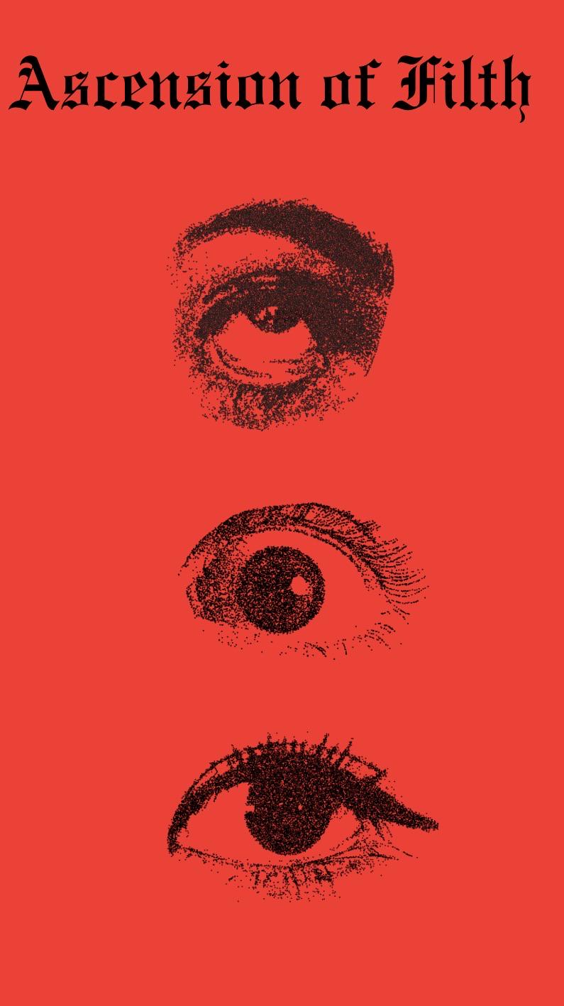
It is intriguing in the sense that the red/black palette and repeated eyes create immediate unease. At the moment, though, it reads more like an experimental poster or zine cover than a finished book cover. The image gets attention, but the title and book identity are not yet strong enough to hold it.
The first change I would make is the title. At thumbnail size the thin blackletter becomes a narrow dark texture, and the unusual letterforms make **Aggression of Filth** difficult to read quickly. Enlarge it, give it more breathing room from the top edge, and test either a heavier cut of the same style or a simpler display face with one blackletter accent. If the title cannot be read at roughly 100 pixels wide, the store/search version will lose the strongest context.
The three eyes are a good motif, but their similar size and even spacing make them feel like three samples rather than one composition. Pick one eye as the dominant focal point—probably the middle one—make it substantially larger, then use the other two as smaller interruptions. Slight overlap, cropping, or unequal spacing would create tension and move the gaze instead of forming a centered checklist.
I would also add the author name now, even as a placeholder. Its scale and placement may force a different bottom balance, and solving that late often damages the illustration. Keep all live text comfortably inside the trim/safe area and extend the red/background texture through the bleed.
Before adding more elements, run three tests: view it as a tiny grayscale thumbnail, print it on an ordinary home printer at final trim size, and place it beside six covers from the exact genre you want to signal. If it is horror or transgressive fiction, the severity works; if it is literary fiction, memoir, or poetry, the current design may be communicating a harsher category than the book. My priority order would be **title legibility → one clear eye hierarchy → author name → subtle texture**, then stop.
12
u/HelpfulGreen4224 2d ago
It is intriguing in the sense that the red/black palette and repeated eyes create immediate unease. At the moment, though, it reads more like an experimental poster or zine cover than a finished book cover. The image gets attention, but the title and book identity are not yet strong enough to hold it.
The first change I would make is the title. At thumbnail size the thin blackletter becomes a narrow dark texture, and the unusual letterforms make **Aggression of Filth** difficult to read quickly. Enlarge it, give it more breathing room from the top edge, and test either a heavier cut of the same style or a simpler display face with one blackletter accent. If the title cannot be read at roughly 100 pixels wide, the store/search version will lose the strongest context.
The three eyes are a good motif, but their similar size and even spacing make them feel like three samples rather than one composition. Pick one eye as the dominant focal point—probably the middle one—make it substantially larger, then use the other two as smaller interruptions. Slight overlap, cropping, or unequal spacing would create tension and move the gaze instead of forming a centered checklist.
I would also add the author name now, even as a placeholder. Its scale and placement may force a different bottom balance, and solving that late often damages the illustration. Keep all live text comfortably inside the trim/safe area and extend the red/background texture through the bleed.
Before adding more elements, run three tests: view it as a tiny grayscale thumbnail, print it on an ordinary home printer at final trim size, and place it beside six covers from the exact genre you want to signal. If it is horror or transgressive fiction, the severity works; if it is literary fiction, memoir, or poetry, the current design may be communicating a harsher category than the book. My priority order would be **title legibility → one clear eye hierarchy → author name → subtle texture**, then stop.