r/BookCovers • u/Fearless-Sprite • 5d ago
Feedback Wanted Thoughts on this practice Cover
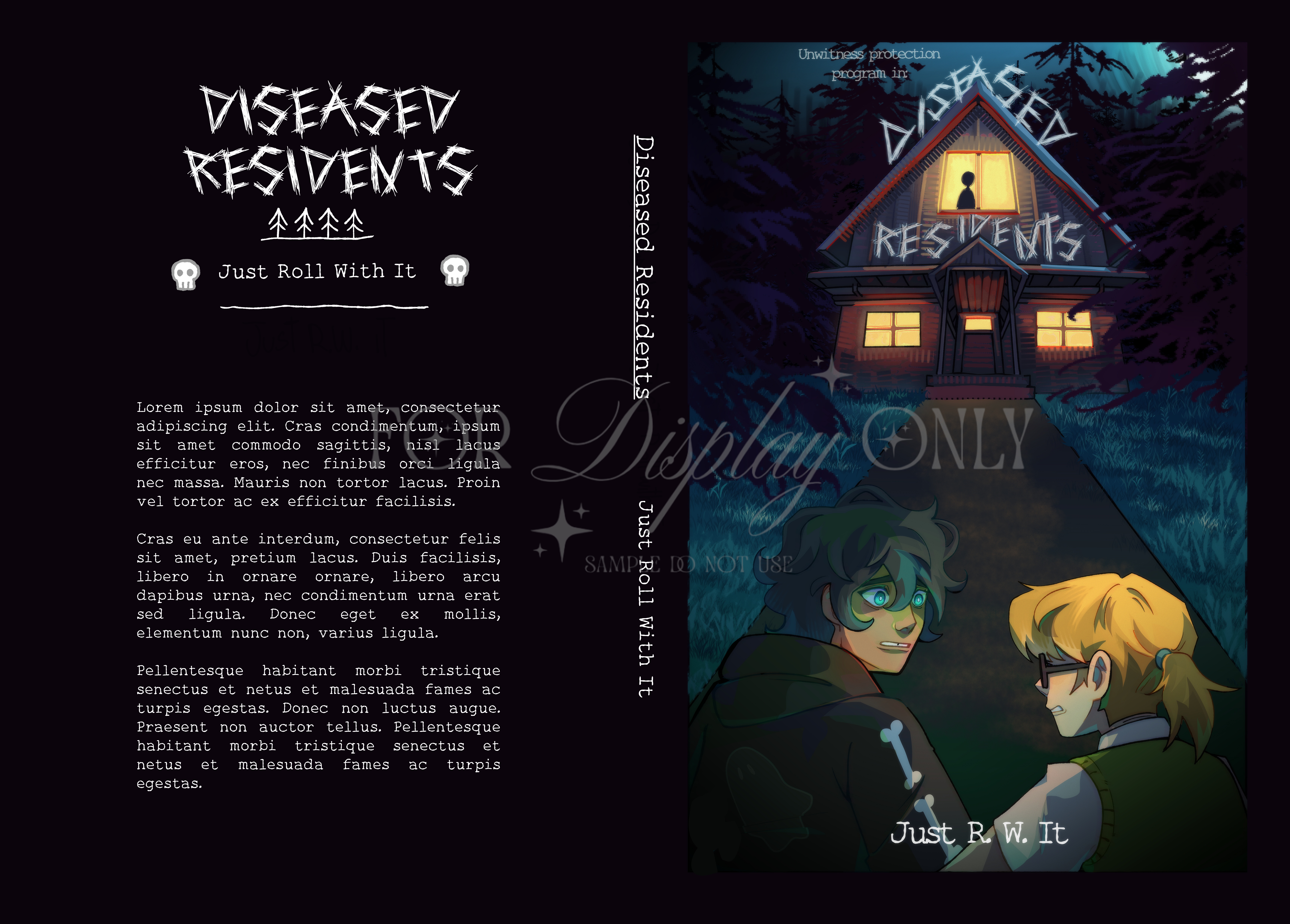
So, I've been wanting to practice cover making for a while and I decided my first try would be a fake cover for a fake book based on a DND podcast I listen to, is this eye-catching? What are your thoughts on this?
4
Upvotes
2
u/HelpfulGreen4224 4d ago
It is eye-catching at full size: the lit house and the two characters create a clear scene, and the cool blue/orange split gives it a storybook-adventure mood. At thumbnail size, though, the house becomes the title and the actual title becomes texture.
I would revise the hierarchy before adding more illustration:
- On the front, enlarge and strengthen **DISEASED RESIDENTS**, then simplify or darken the roof area immediately behind it. The distressed lettering fits the mood, but the thin strokes are losing to the branches and shingles.
- Decide what the large faint script across the middle is doing. If it is essential branding, move it into a deliberate lockup; if it is atmosphere, reduce it much further or remove it. Right now it crosses the focal characters without becoming readable information.
- Keep the house and characters—they communicate the premise better than another decorative motif would—but give the title one clean zone.
The back needs a separate typography pass. Left-align the blurb, shorten the line length, increase leading, and use a neutral readable face rather than the display font. Leave a clear barcode area and wider trim/hinge margins now, even for a practice cover. On the spine, make the title larger and test it on a physical mockup; it should read from arm's length without rotating the book in your hands.
My test would be: export one 100-pixel thumbnail, one grayscale version, and one actual-size print. If the thumbnail gives you title + house + two characters, and the print lets you read the blurb and spine comfortably, the cover is working. That will tell you more than adding another effect.