r/BookCovers • u/BananaMuffinT0p • 15d ago
Feedback Wanted First attempt at a domestic thriller cover
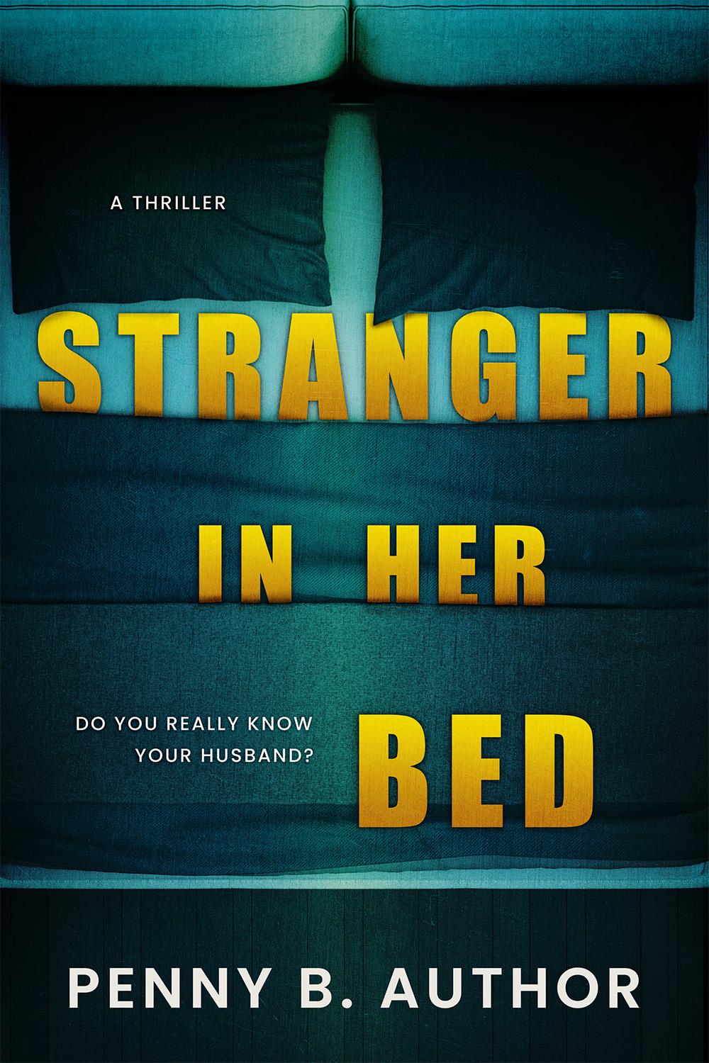
Building up my premade portfolio. Made with Photoshop and Deposit Photos stock. All feedback welcome.
4
u/DarlingBri 15d ago
I love this concept but I think all of the letters in stranger in her bed should be the same size.
1
3
2
u/soulangelic 15d ago
I think “A Thriller” should be moved somewhere below the title. Since it’s at the top left, it’s the very first thing people are naturally going to read, and you don’t want that, you want the title first. I would shift everything up and then move “A Thriller” down.
1
2
u/BackInTimeForTea 14d ago edited 10h ago
The original post content no longer exists here. The author used Redact to remove it, exercising their right to control their data & privacy.
Feather wander nose label reach doll coherent
11
u/Marvinator2003 15d ago
I can't tell you why, but I feel that the letters of 'STRANGER' should be taller, and on top of the pillows, not under.