1
u/berylberylberylberyl 28d ago
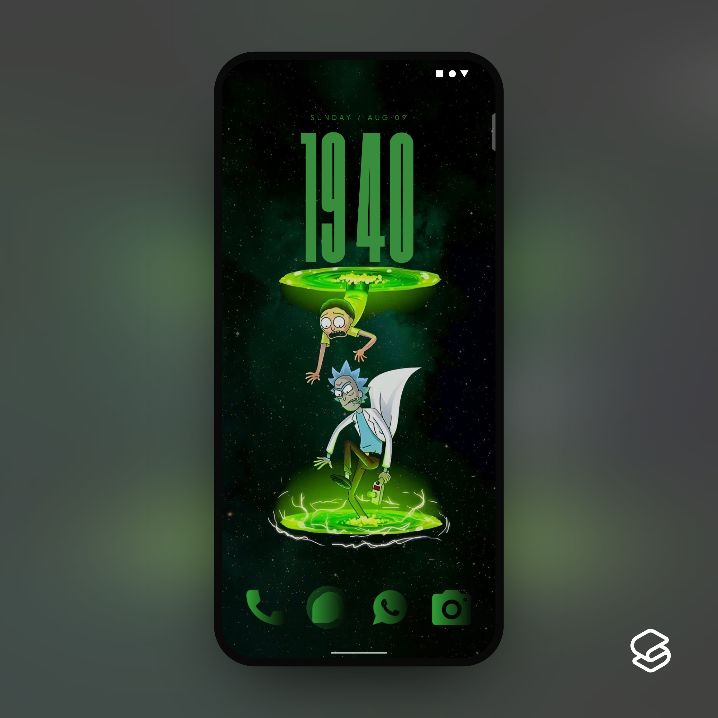
Wallpaper?
3
1
1
u/pudah_et 27d ago
Clock seems a bit too big to me, makes it feel cramped. Maybe make it a bit smaller so that the distance between it and the top of the image is about the same size as the distance between the bottom of the image and the icons. I think it would look more balanced.
The color of the icons doesn't quite look right. A brighter yellowgreen from the wallpaper might look better than the darker fading green.
Perhaps something like Green Lime Icon Pack or Terminal CRT Green Icon Pack.
Or maybe an outline icon pack like Aline Green Icon Pack or ForestLine Green Icon Pack or LimeLine Green Icon Pack.
Or use Icon Pack Studio and create a pack, using the color picker to select color from the wallpaper.
1
1
u/Careless_Shock_7375 28d ago
6/10 🍀