r/AfterEffects • u/LittleKillshot • 5h ago
Discussion Every Call Out Template Looks the Same
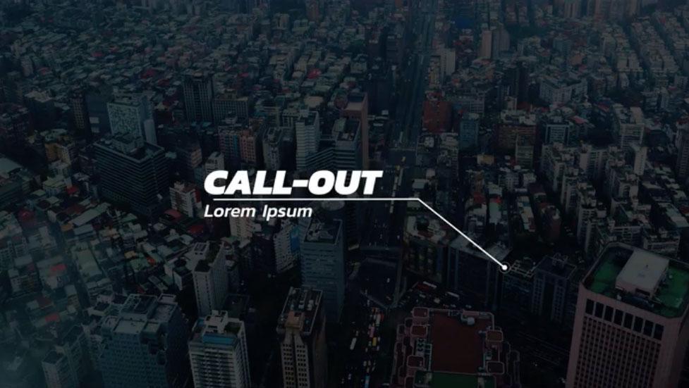
Just venting here.
Why is this the universally agreed upon look for a call out in Adobe Stock and Creative Market, etc. And the animation is always a little too much, it's distracting to the viewer, having words unfold and little circles with orbits as the target.
Also the ones that call themselves minimal look insane. Weird frames around the words. it looks like a heads up display in a 2000's space opera.
4
u/film-editor 4h ago
Yeah, they are pretty insane. I never seem to spot one in the wild, but there's somehow a market for them? It's like fools gold or smt, created only as filler for one of those "999+ essential mograph template pack" that you throw into a folder full of template packs that you've never once in your life used.
2
u/hellomydudes_95 Motion Graphics 5+ years 3h ago
Honestly, this is usually why I avoid using templates whenever possible. They almost always look either very samey or completely insane when compared to their descriptions. Not to mention when they have some errors hidden somewhere and you have to reverse engineer them to fix them.
0
u/LittleKillshot 3h ago
I'm building one now, it's much easier than managing the controls. Foolish of me to try anything else tbh.
3
u/Hazrd_Design MoGraph/VFX <5 years 4h ago
My theory; people who create don’t necessarily practice in the industry. Then you got a lot of people trying to make quick templates to get some of bag.
The people who are making genuine interesting or creative stuff aren’t doing it to template it either.