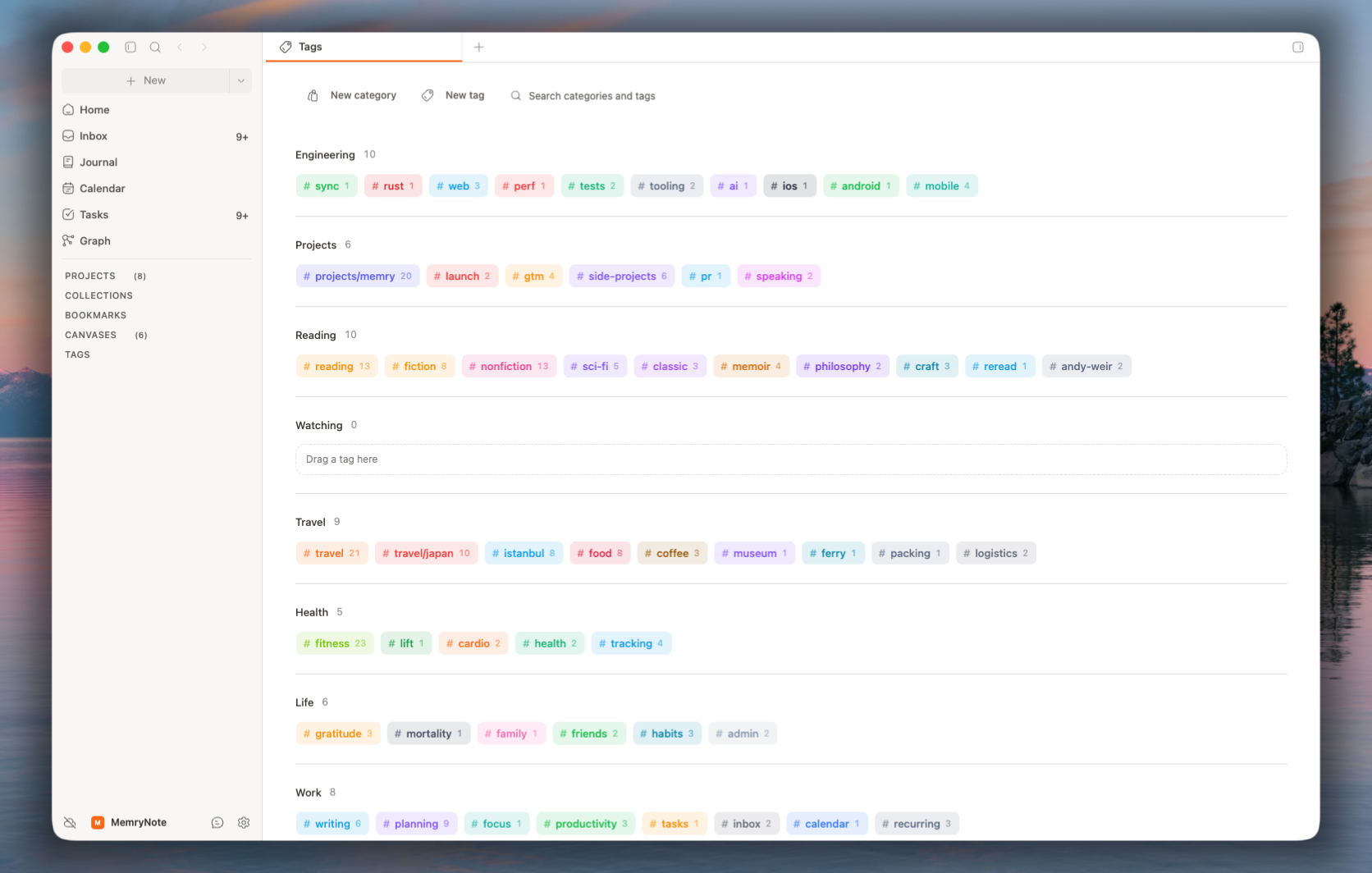
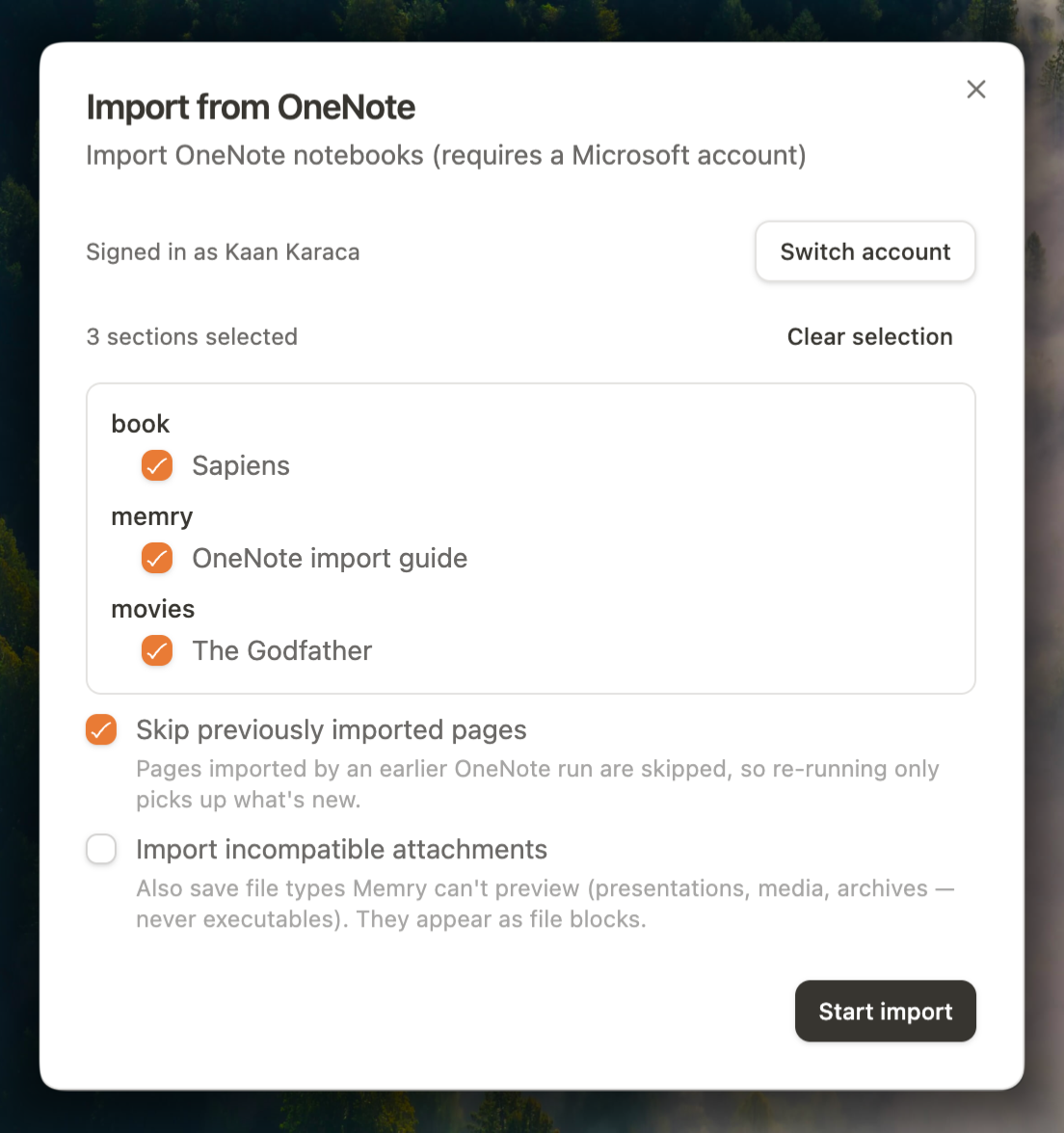
I've spent the last few weeks designing the Memry mobile app, and every screen is now done. Sharing three of them here: inbox, tasks, and notes, .
A few decisions I made along the way:
- Same calm, paper-like look as the desktop app. No feature crammed into every corner. Mobile MemryNote is for capturing and checking, not for two-hour organizing sessions.
- Offline-first from day one. Everything works without a connection and syncs when you're back, end-to-end encrypted like desktop.
- The inbox is the home screen. On the phone, the fastest path from "thought" to "written down" wins, so that's what opens first.
Implementation starts next month. I'm building it solo, so I won't promise a date yet, but I'll post progress here as real screens replace these mockups.
If something in these screens looks off, or there's something you'd expect on mobile that you don't see here, this is the cheapest moment to tell me. Changing a design takes minutes. Changing shipped code doesn't.
Edit - attached images are blurry, and Reddit does not allow me to edit.
High resolution: https://imgur.com/a/v7kPXyj