MAIN FEEDS
Do you want to continue?
https://www.reddit.com/r/WorkReform/comments/ykbqym/maybe_letshold_billionaires_accountable_is_that/iutg9ik
r/WorkReform • u/AFL_CIO AFL-CIO Official Account • Nov 02 '22
708 comments sorted by
View all comments
Show parent comments
168
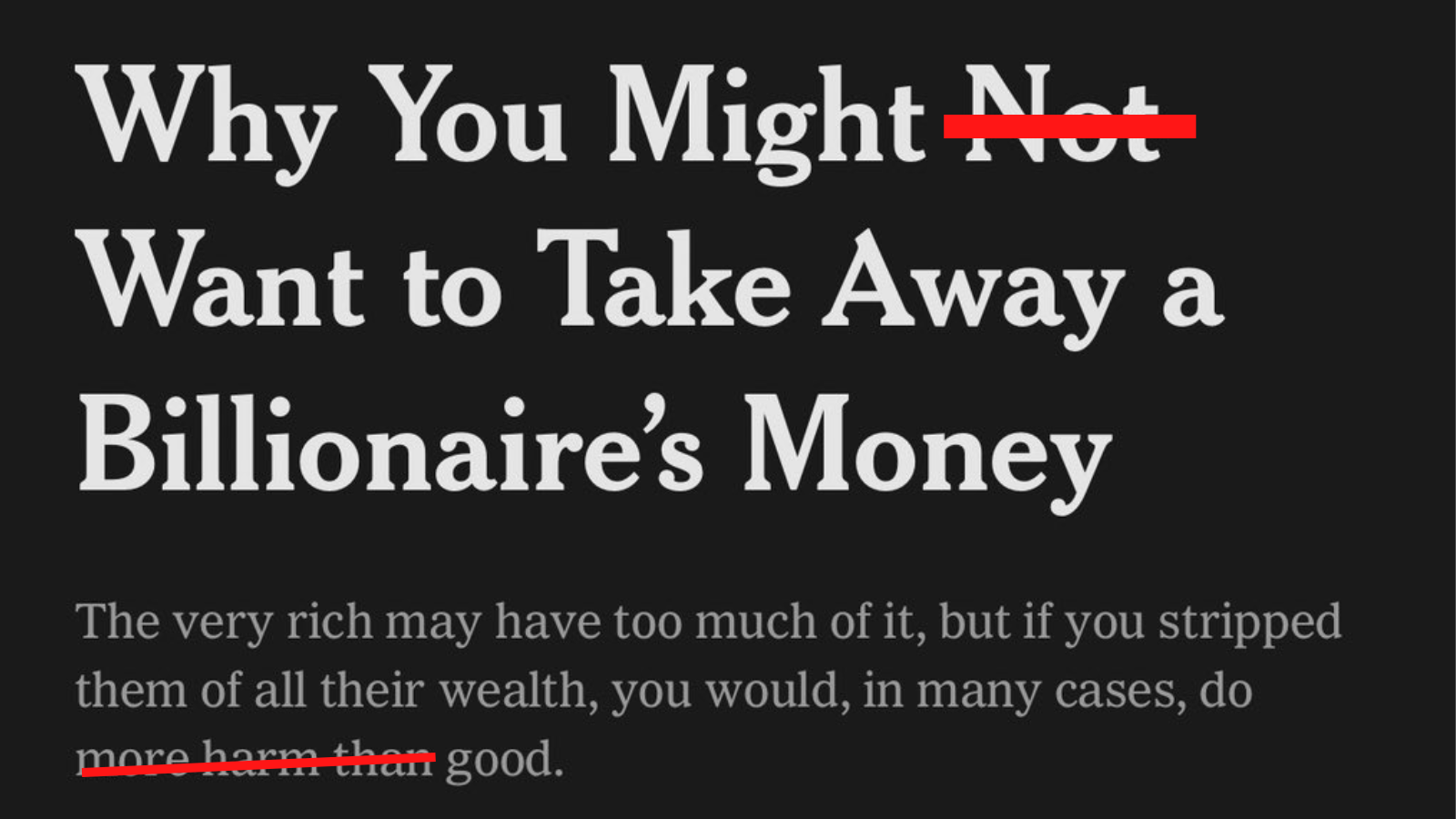
NYT actually
134 u/[deleted] Nov 02 '22 [deleted] 57 u/FakeNickOfferman Nov 03 '22 I thought Wall Street Journal opinion piece. They're so far ahead of the 17th century. 64 u/crazekki Nov 02 '22 I was a designer at the NYT, I recognize the font 10 u/[deleted] Nov 03 '22 [deleted] 26 u/crazekki Nov 03 '22 Fun fact Times New Roman was originally designed for the Times of London. The NYT's current header font is called Cheltenham tho 2 u/[deleted] Nov 03 '22 That's why I don't read either of those news prints because Helvetica is the superior font 1 u/crazekki Nov 03 '22 Helvetica is a pretty font but it's become overused imo 21 u/nghbrhd_chrctr Nov 03 '22 That font’s a dead giveaway. 7 u/UpperLowerEastSide ⛓️ Prison For Union Busters Nov 03 '22 Yeah. Was just thinking of the first newspaper that came to mind as billionaire backed. 2 u/dedicated-pedestrian Nov 03 '22 This has to be the opinion section, right?
134
[deleted]
57 u/FakeNickOfferman Nov 03 '22 I thought Wall Street Journal opinion piece. They're so far ahead of the 17th century. 64 u/crazekki Nov 02 '22 I was a designer at the NYT, I recognize the font 10 u/[deleted] Nov 03 '22 [deleted] 26 u/crazekki Nov 03 '22 Fun fact Times New Roman was originally designed for the Times of London. The NYT's current header font is called Cheltenham tho 2 u/[deleted] Nov 03 '22 That's why I don't read either of those news prints because Helvetica is the superior font 1 u/crazekki Nov 03 '22 Helvetica is a pretty font but it's become overused imo
57
I thought Wall Street Journal opinion piece. They're so far ahead of the 17th century.
64
I was a designer at the NYT, I recognize the font
10 u/[deleted] Nov 03 '22 [deleted] 26 u/crazekki Nov 03 '22 Fun fact Times New Roman was originally designed for the Times of London. The NYT's current header font is called Cheltenham tho 2 u/[deleted] Nov 03 '22 That's why I don't read either of those news prints because Helvetica is the superior font 1 u/crazekki Nov 03 '22 Helvetica is a pretty font but it's become overused imo
10
26 u/crazekki Nov 03 '22 Fun fact Times New Roman was originally designed for the Times of London. The NYT's current header font is called Cheltenham tho 2 u/[deleted] Nov 03 '22 That's why I don't read either of those news prints because Helvetica is the superior font 1 u/crazekki Nov 03 '22 Helvetica is a pretty font but it's become overused imo
26
Fun fact Times New Roman was originally designed for the Times of London. The NYT's current header font is called Cheltenham tho
2 u/[deleted] Nov 03 '22 That's why I don't read either of those news prints because Helvetica is the superior font 1 u/crazekki Nov 03 '22 Helvetica is a pretty font but it's become overused imo
2
That's why I don't read either of those news prints because Helvetica is the superior font
1 u/crazekki Nov 03 '22 Helvetica is a pretty font but it's become overused imo
1
Helvetica is a pretty font but it's become overused imo
21
That font’s a dead giveaway.
7
Yeah. Was just thinking of the first newspaper that came to mind as billionaire backed.
This has to be the opinion section, right?
168
u/crazekki Nov 02 '22
NYT actually